MY WORK
brian the barber
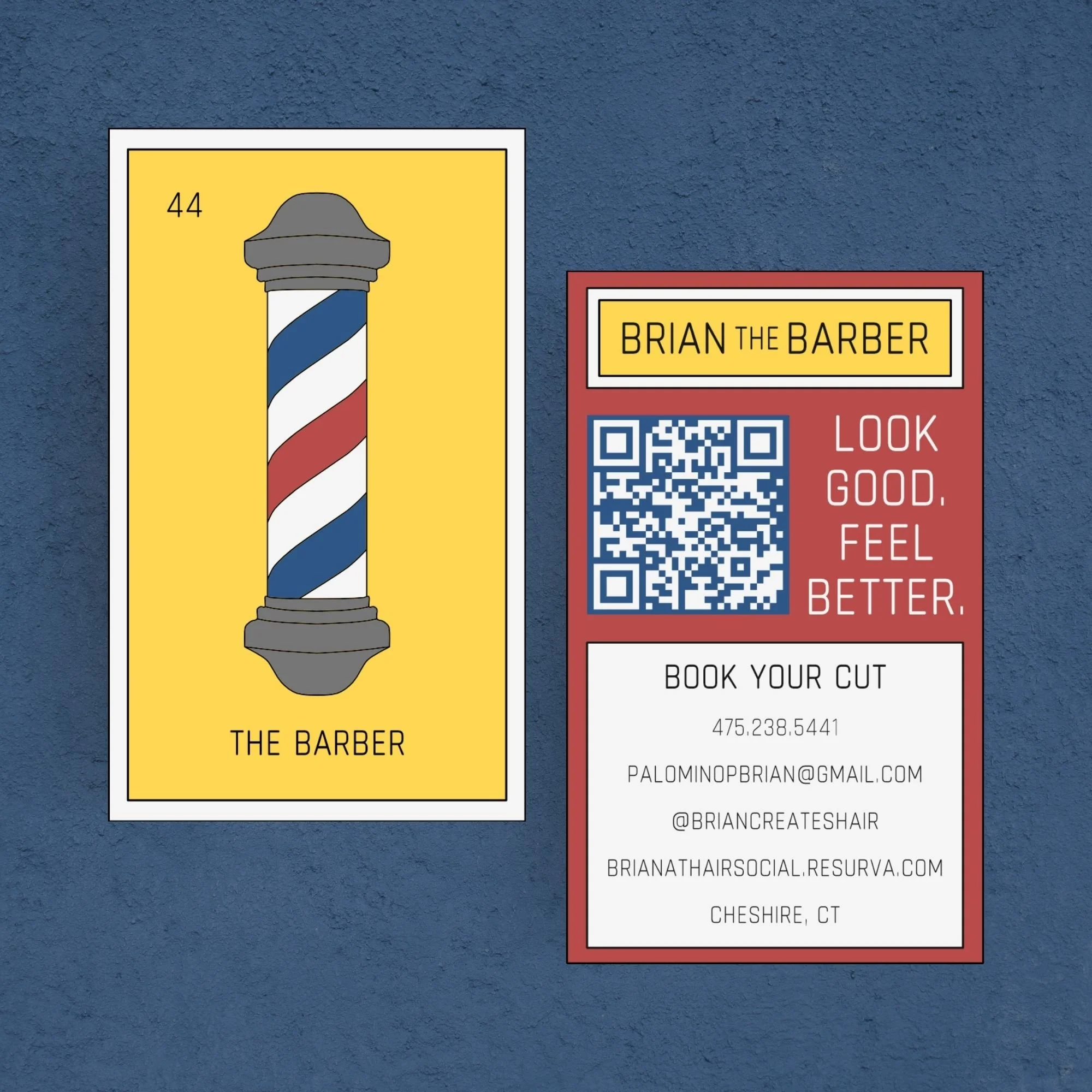
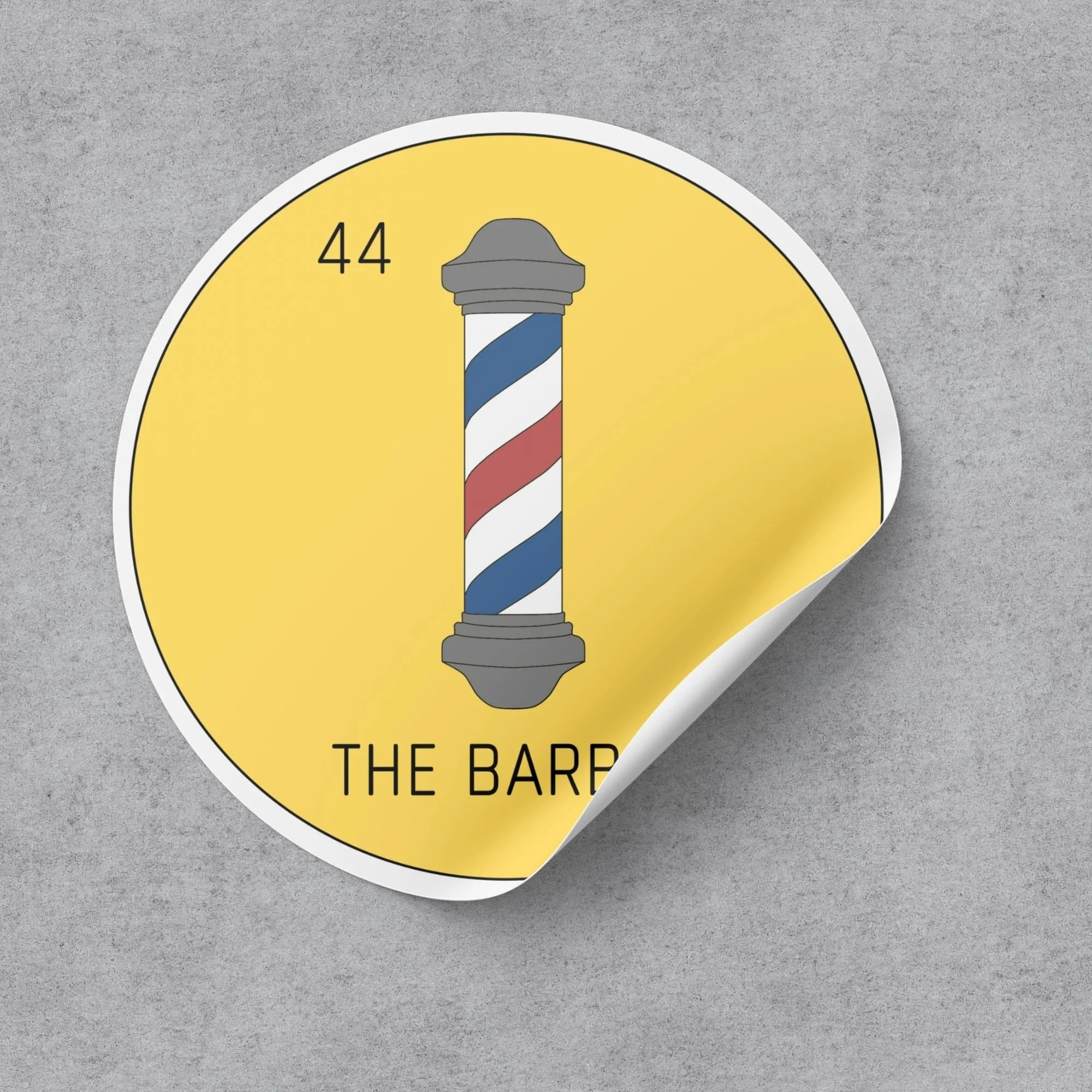
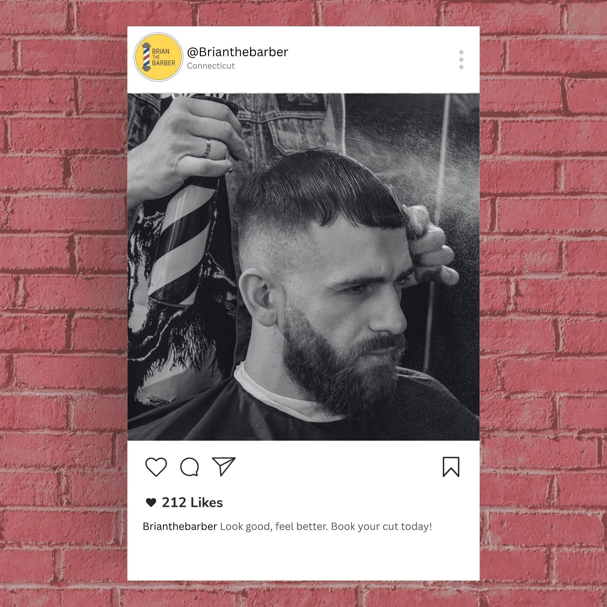
Brian initially came to me looking for a business card to promote his work as a barber. Before creating individual assets, I wanted to establish a strong visual identity that could extend beyond a single application. Drawing inspiration from the bold colors and playful style of traditional Lotería cards, I developed a logo, typography, and color palette that gave his brand a distinct personality. I then applied the identity to his business card and social media profile, creating a cohesive foundation for his brand.
lularoo bakery
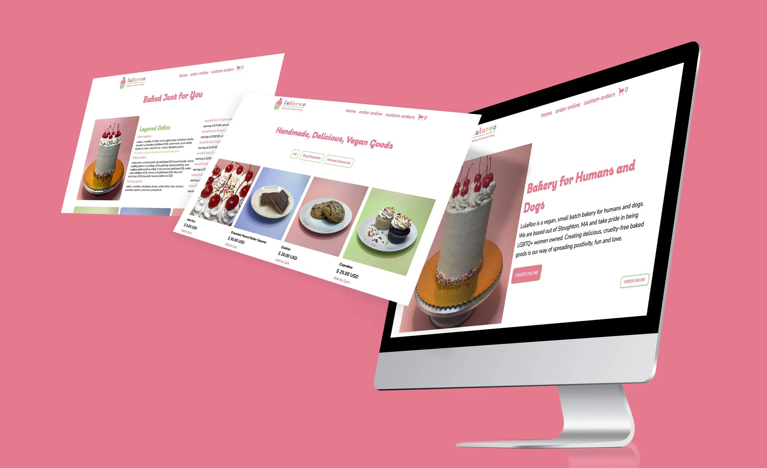
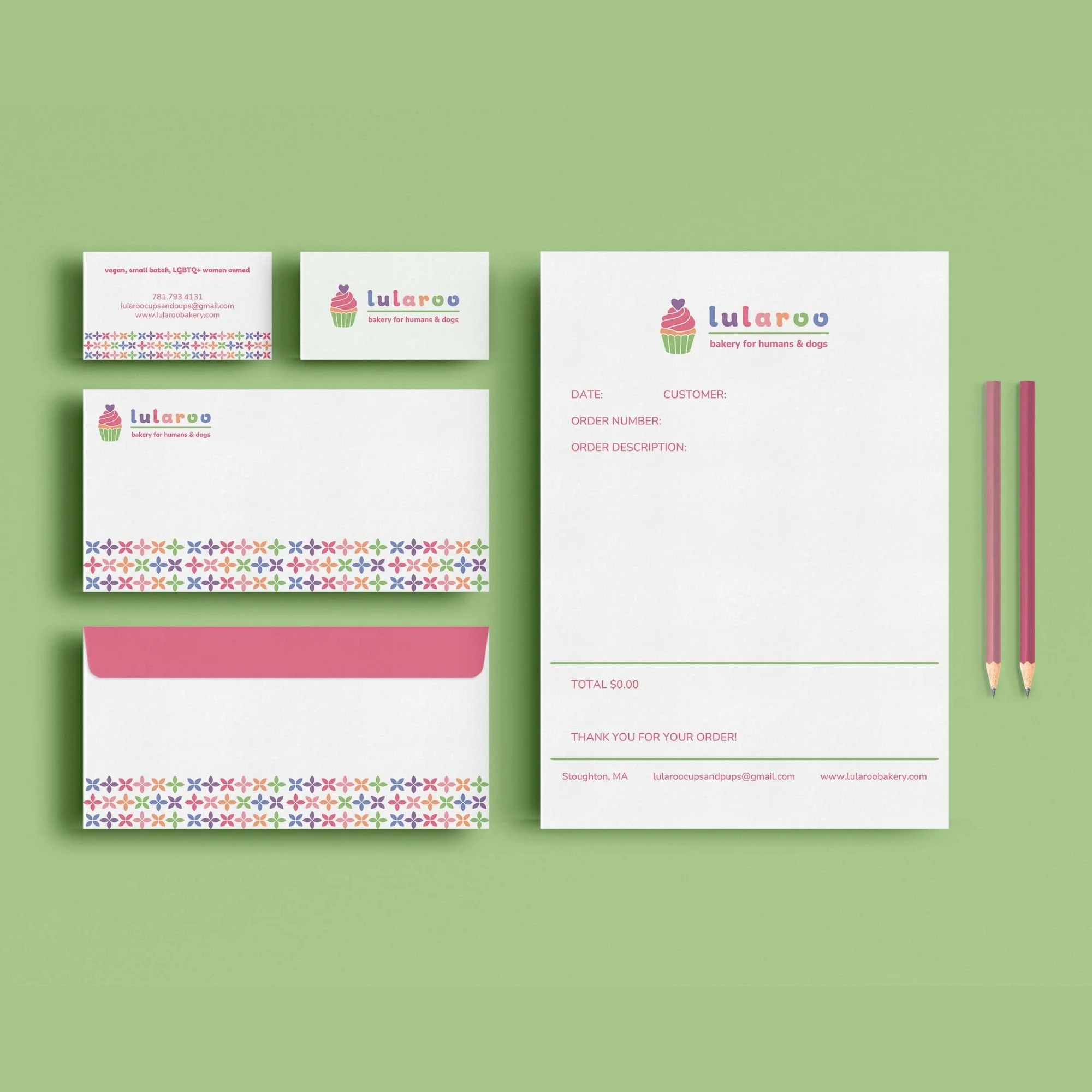
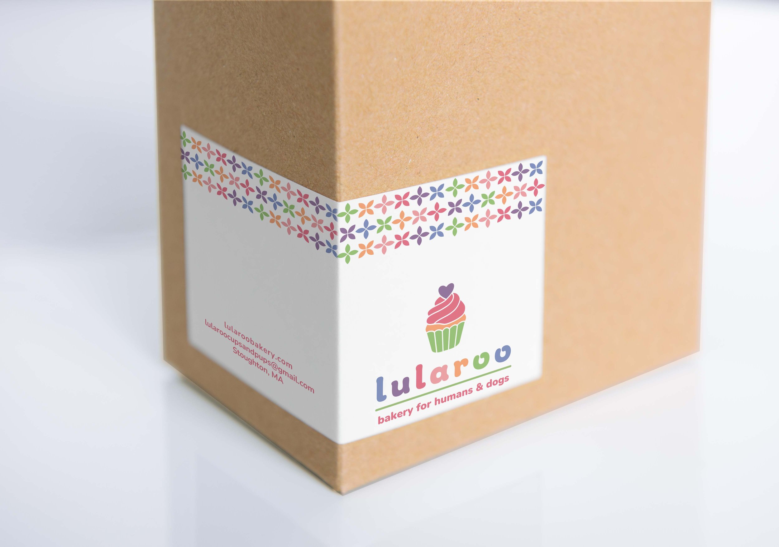
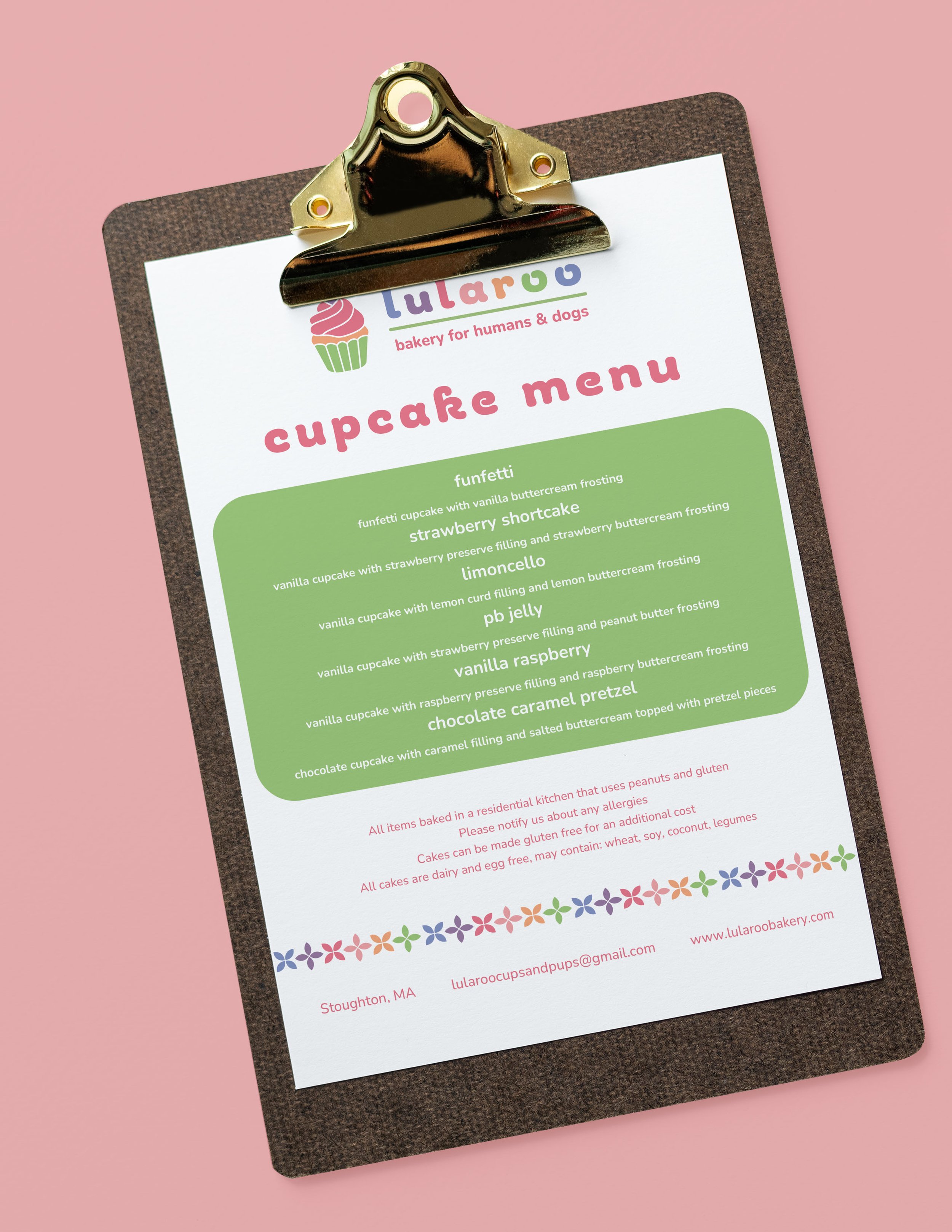
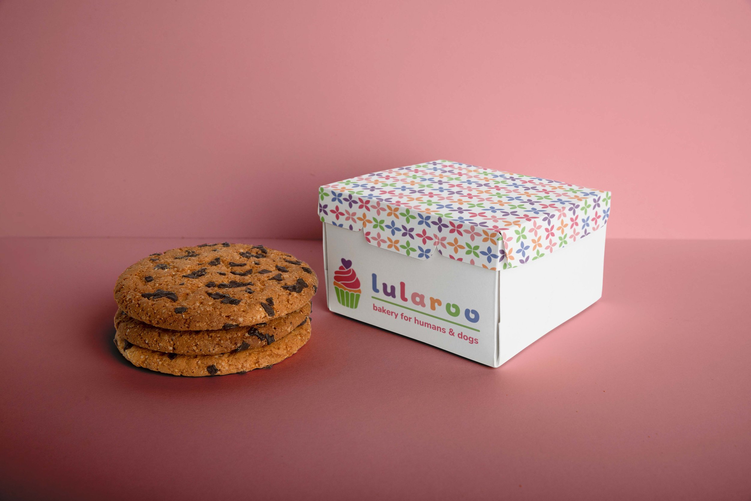
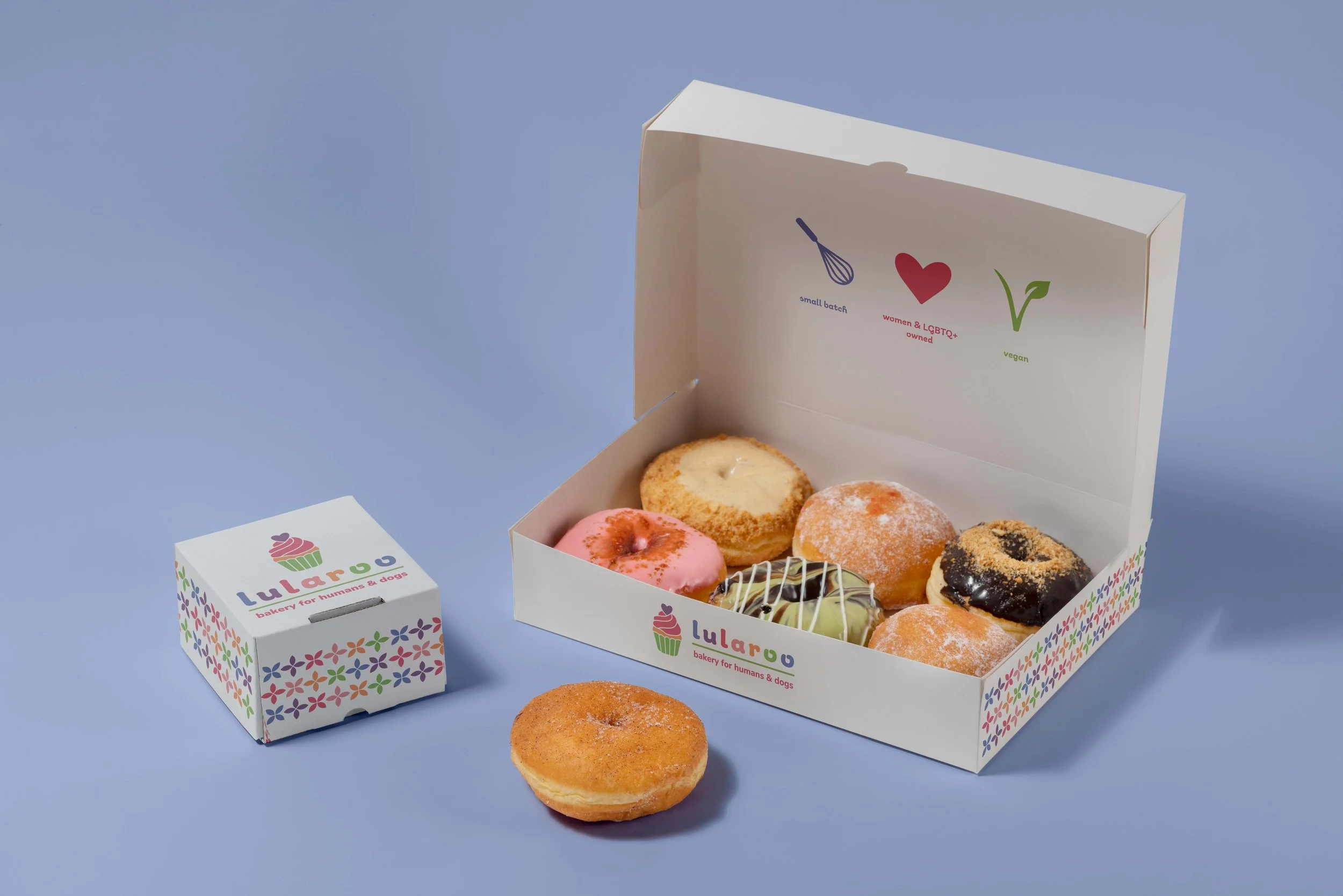
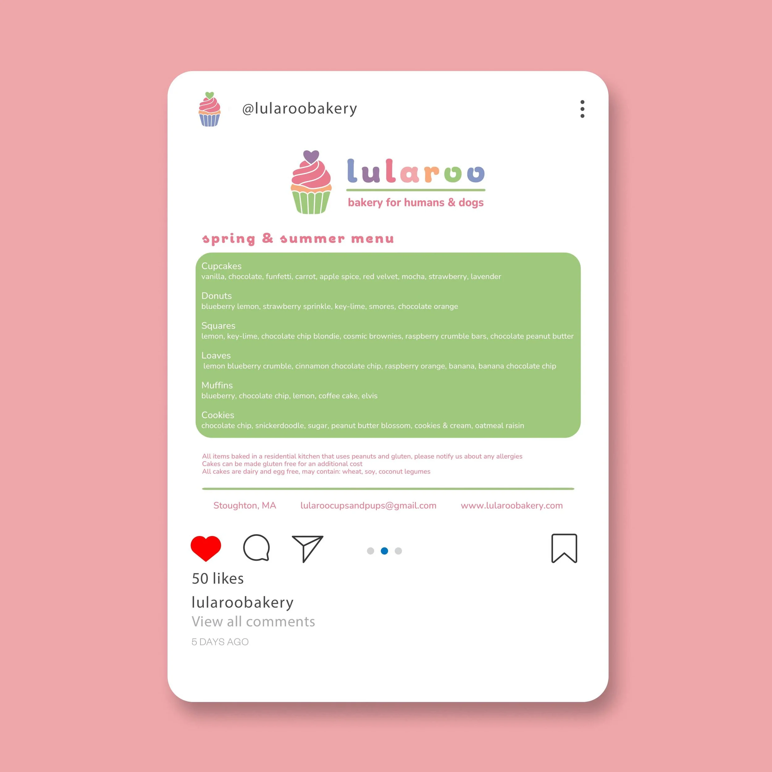
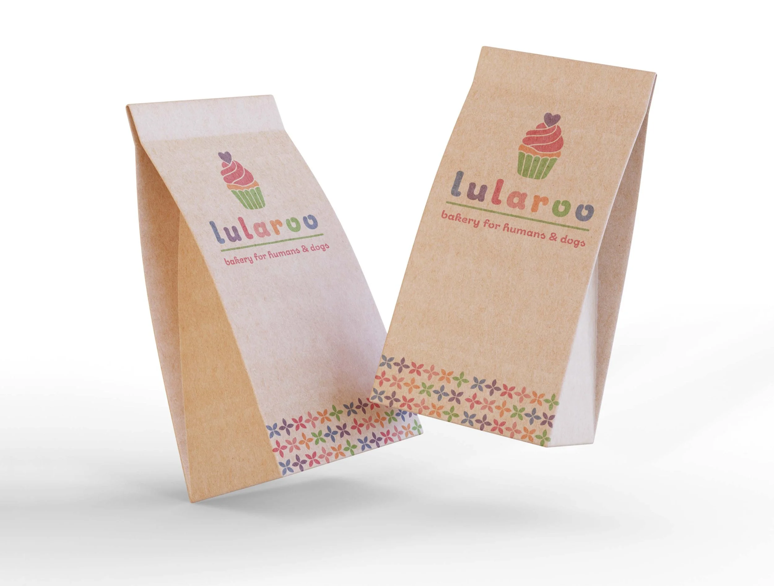
When I first connected with LulaRoo Bakery, the business had a limited visual identity. I worked closely with the client to understand their goals and vision before developing a cohesive brand identity and supporting assets, including a menu, invoice template, and stationery. I also photographed and edited their products to create imagery that complemented the new visual direction. To bring the brand online, I designed and developed an e-commerce website that streamlined purchasing and order processing, made their products more accessible, and strengthened brand recognition. Together, the website, photography, and visual identity created a cohesive brand experience that continues to distinguish LulaRoo Bakery.
new york lunch box
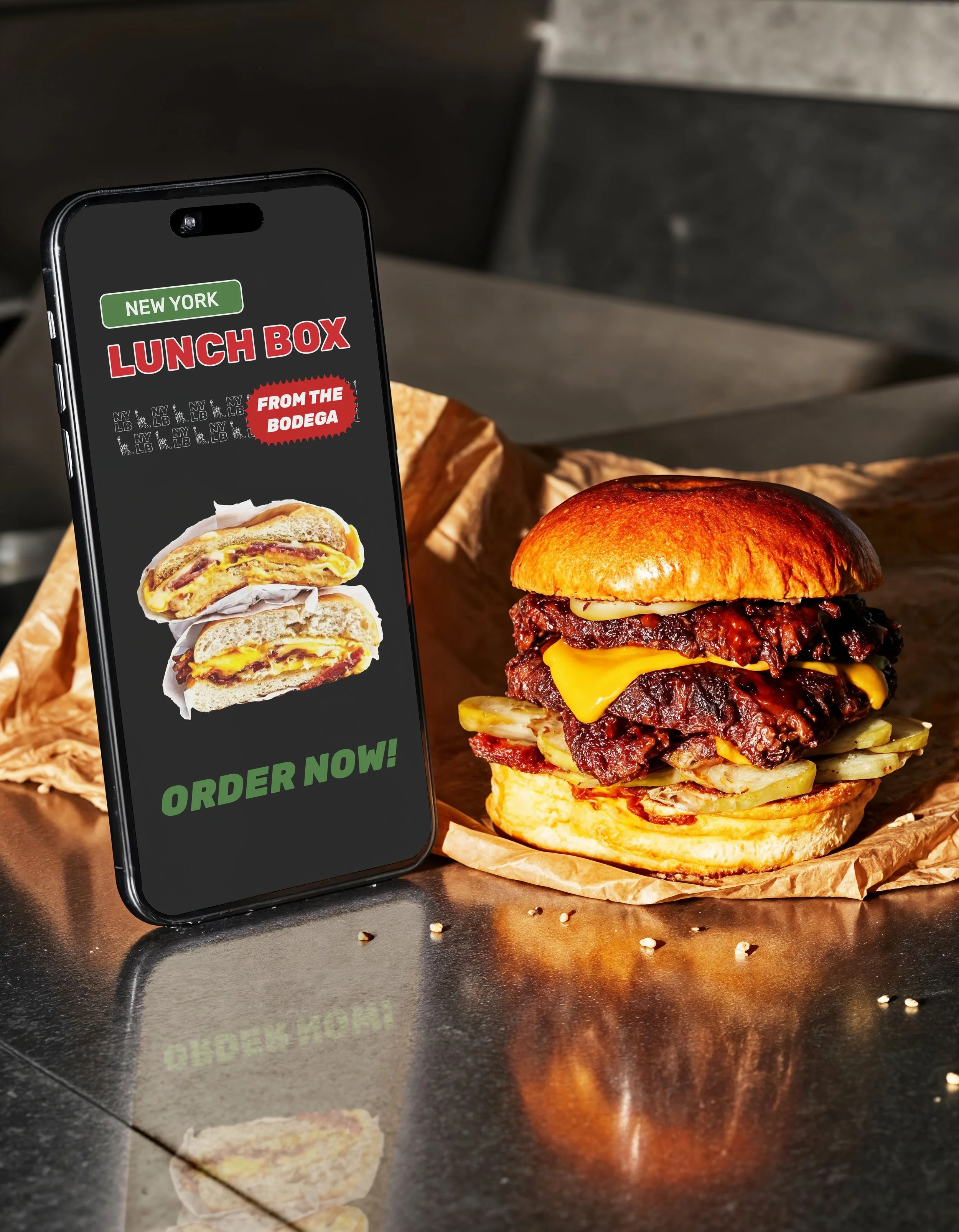
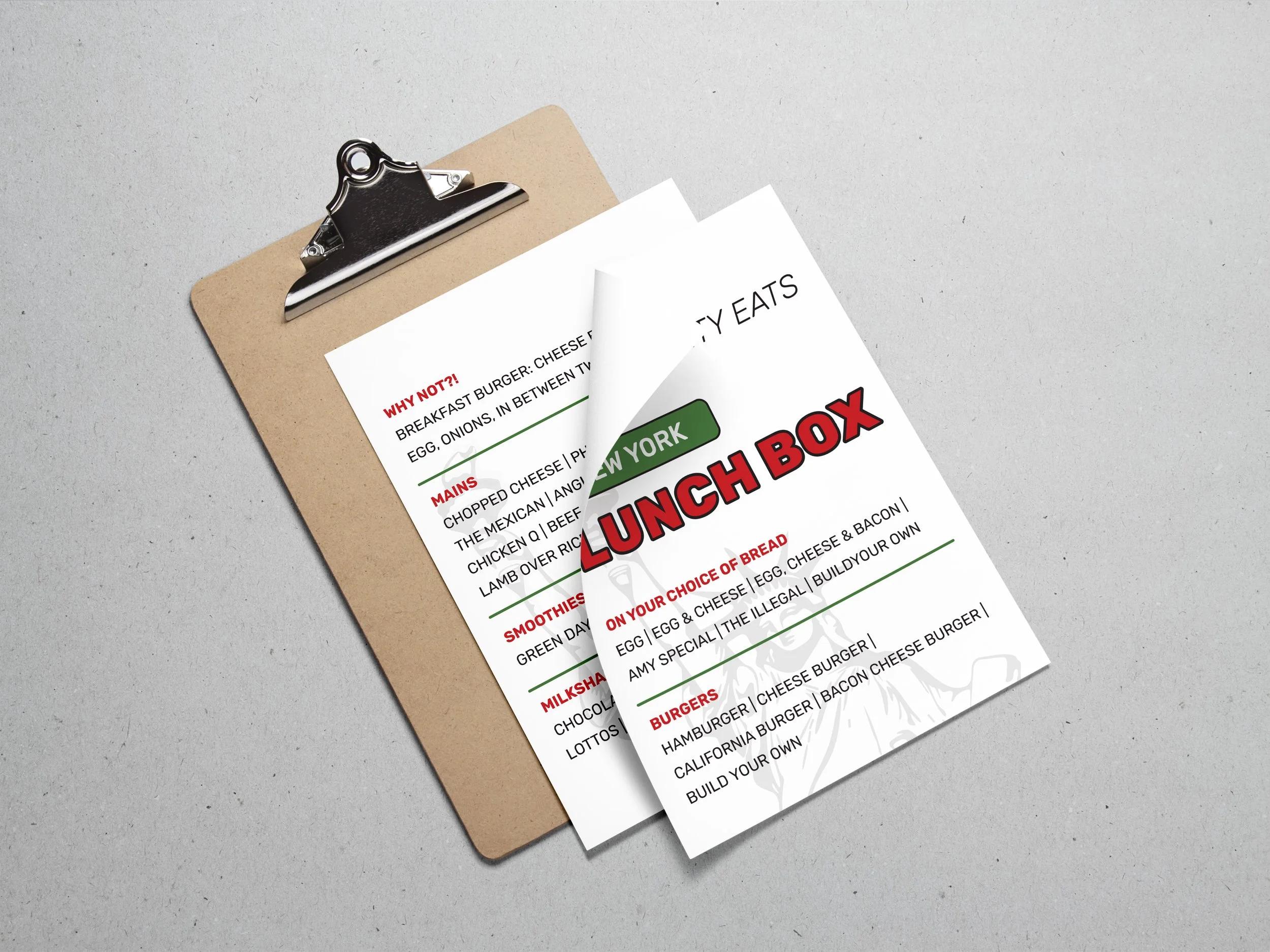
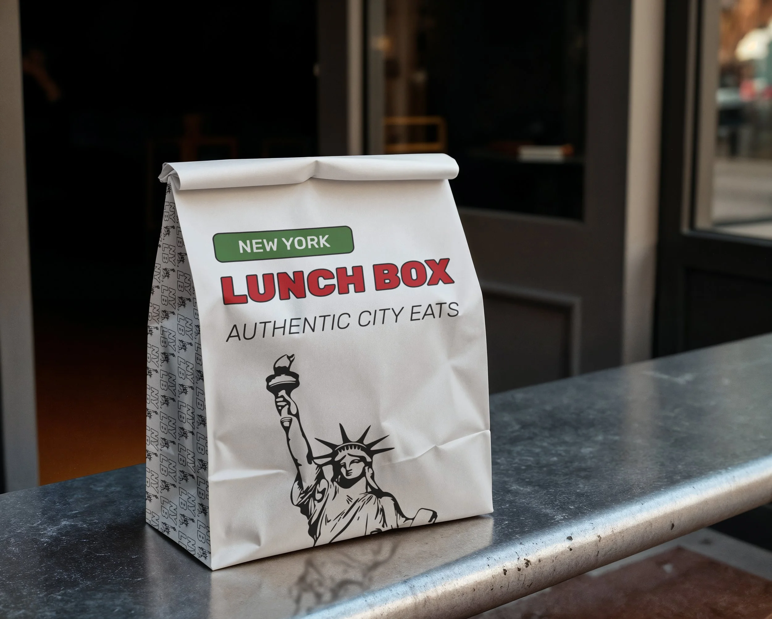
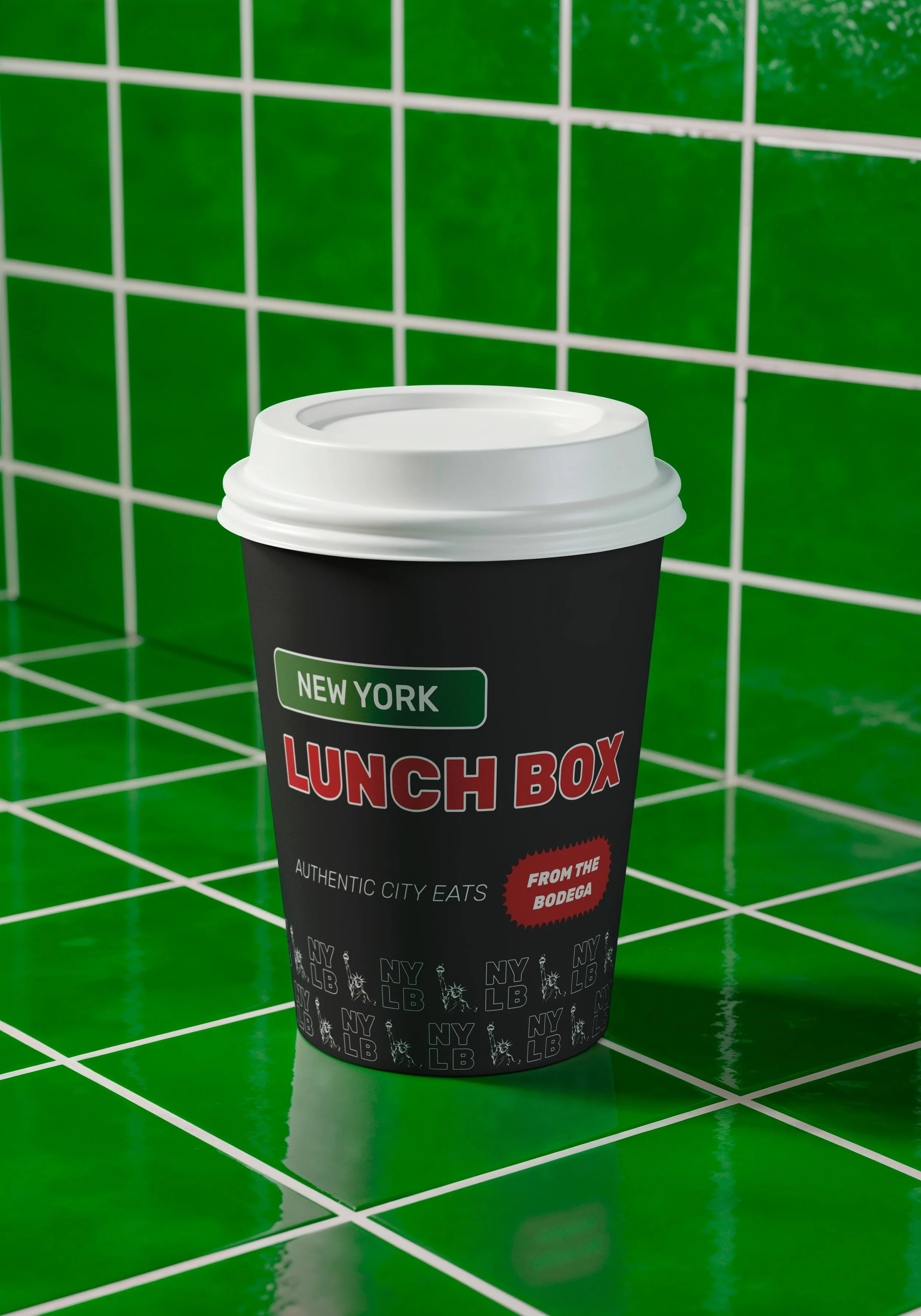
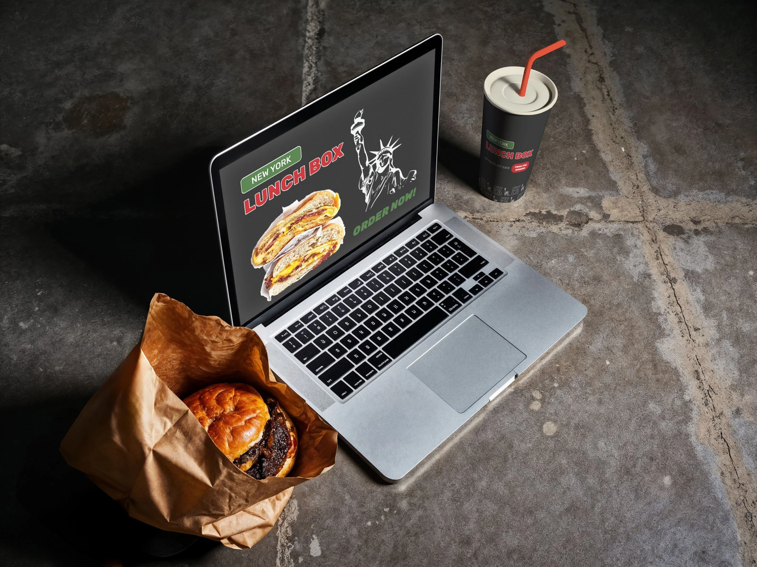
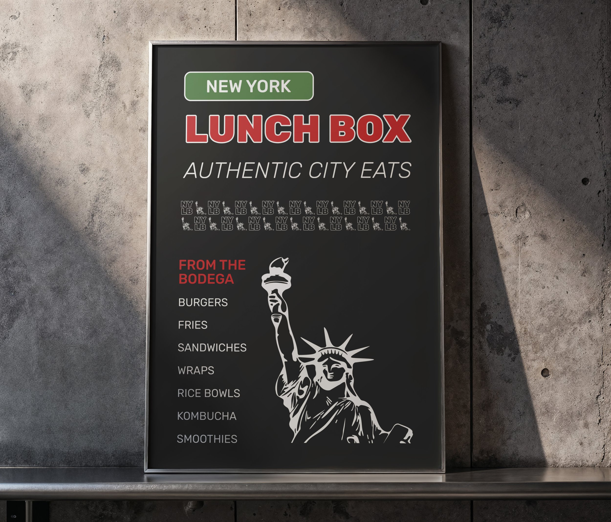
New York Lunch Box, or NYLB, is a brand designed to reflect New York City's street culture. Inspired by corner bodegas, the visual identity blends utilitarian design with iconic city symbols. Though this project was never completed due to the client’s personal circumstances, it remains an impactful exploration of authentic, city-driven branding.
hampshire college
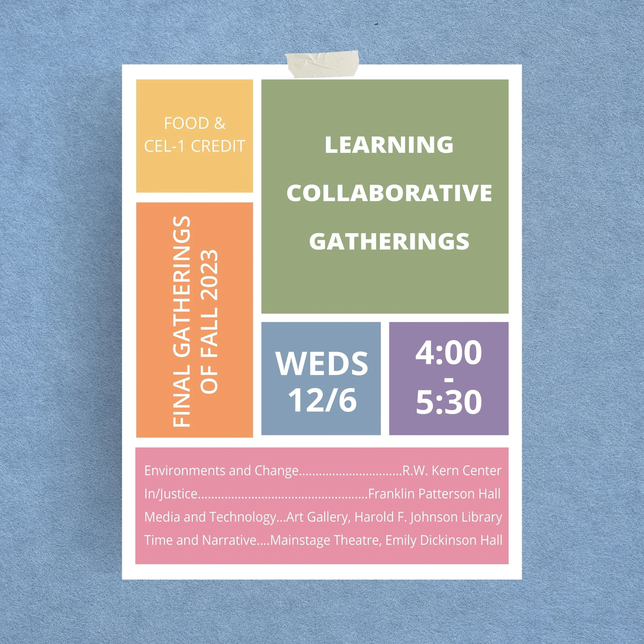
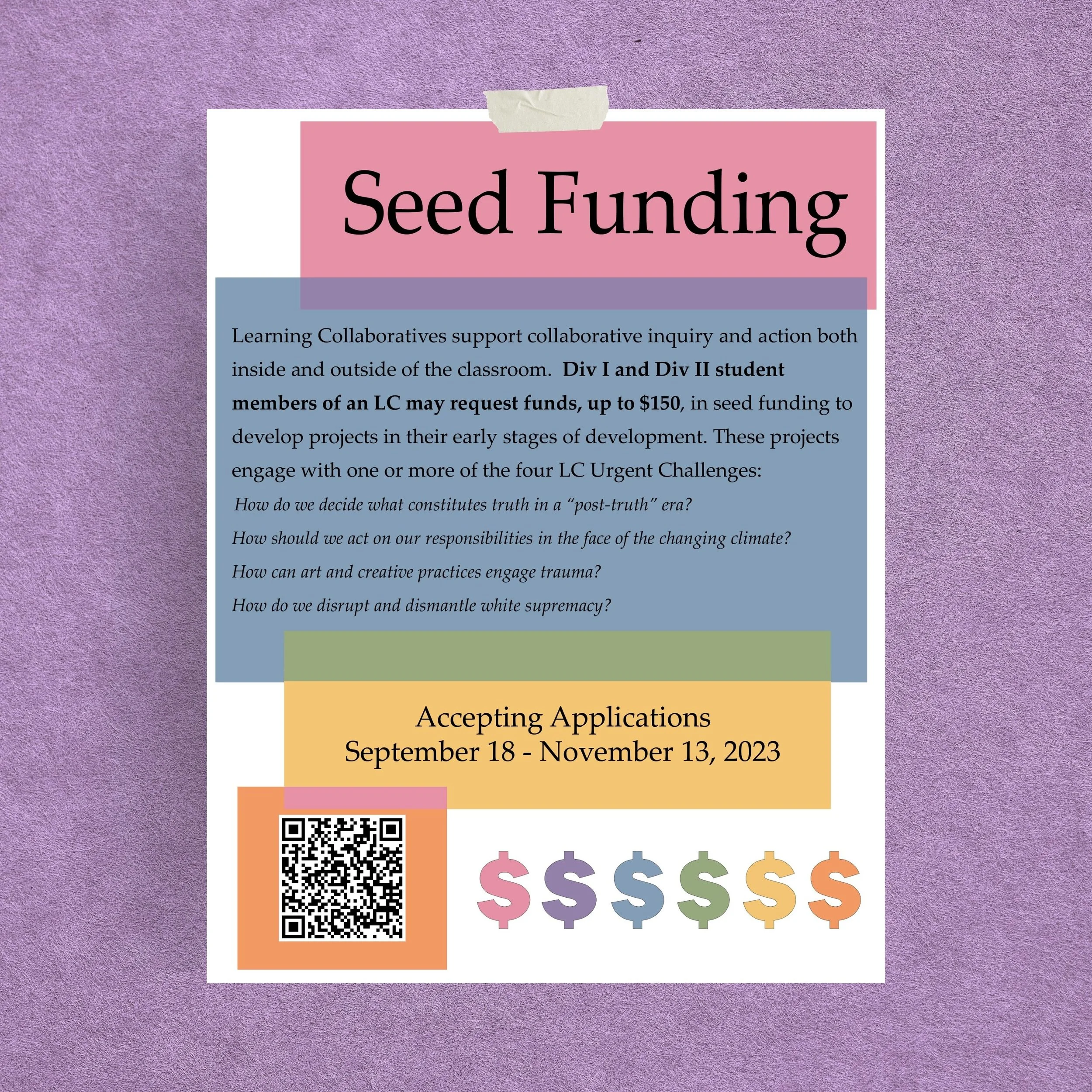
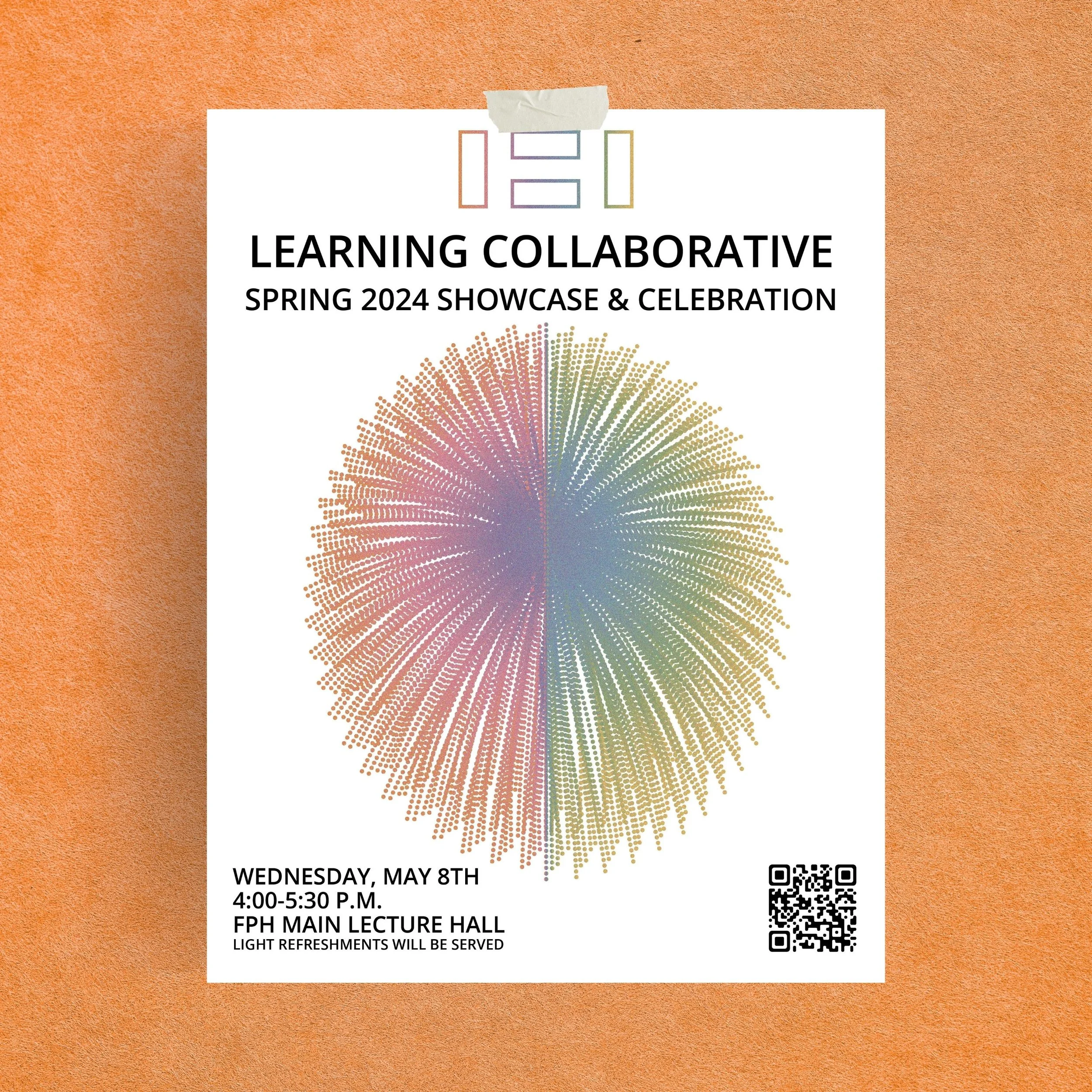
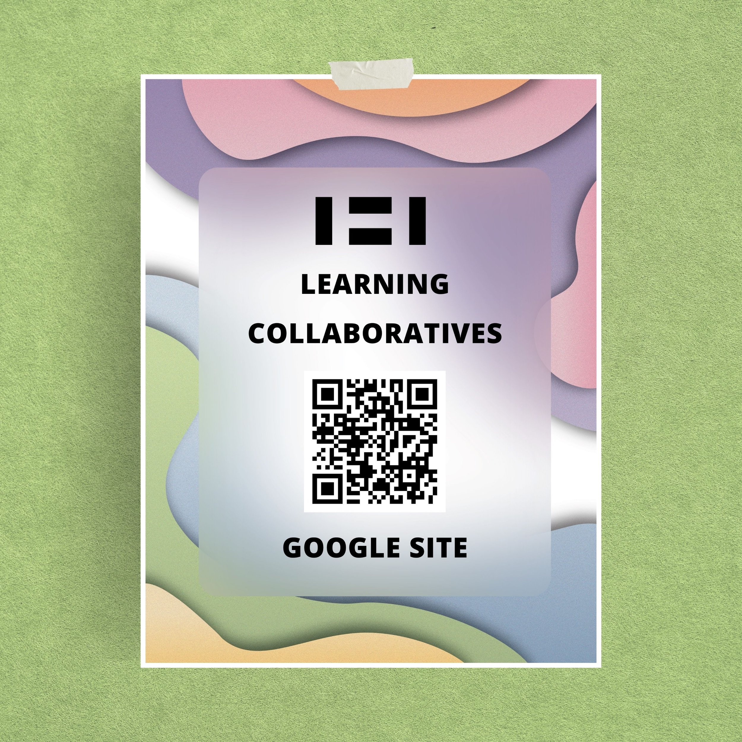
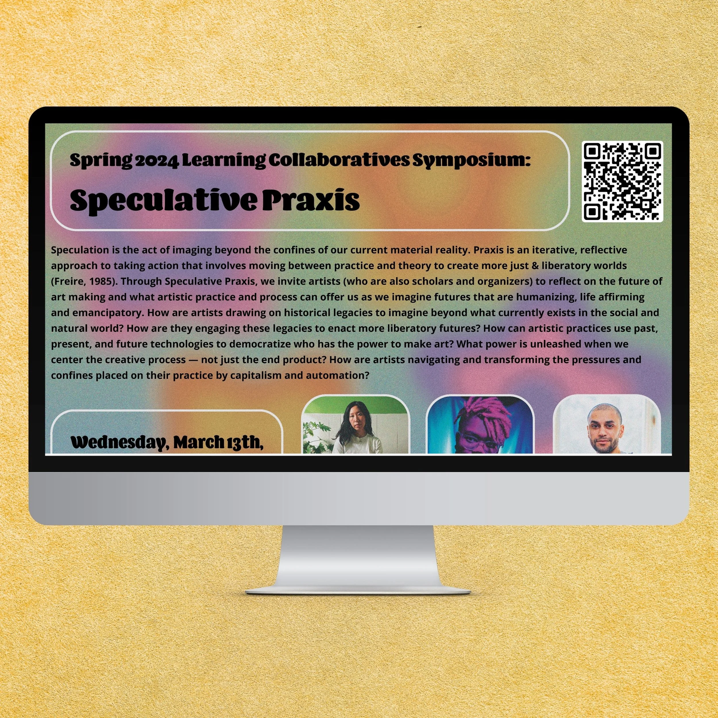
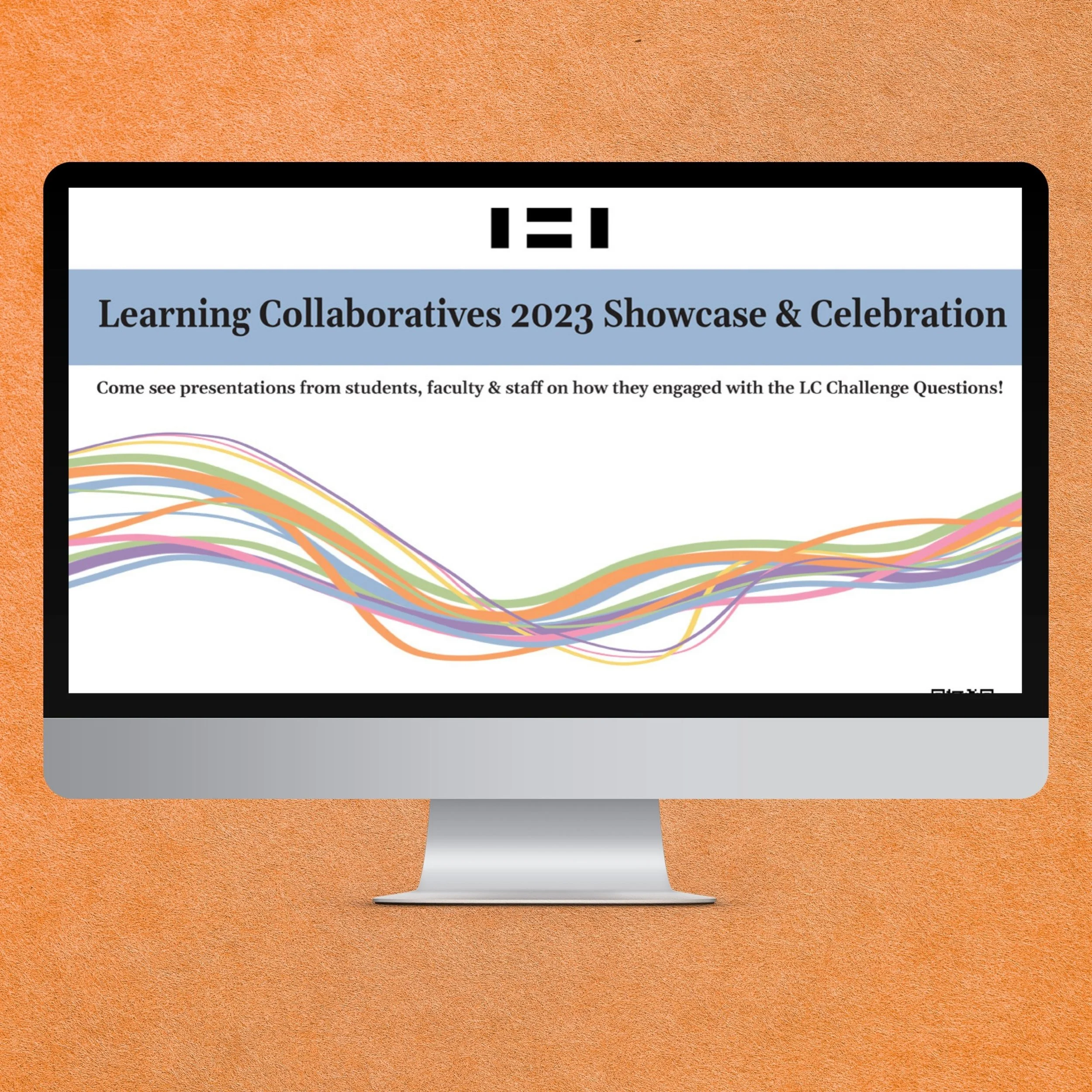
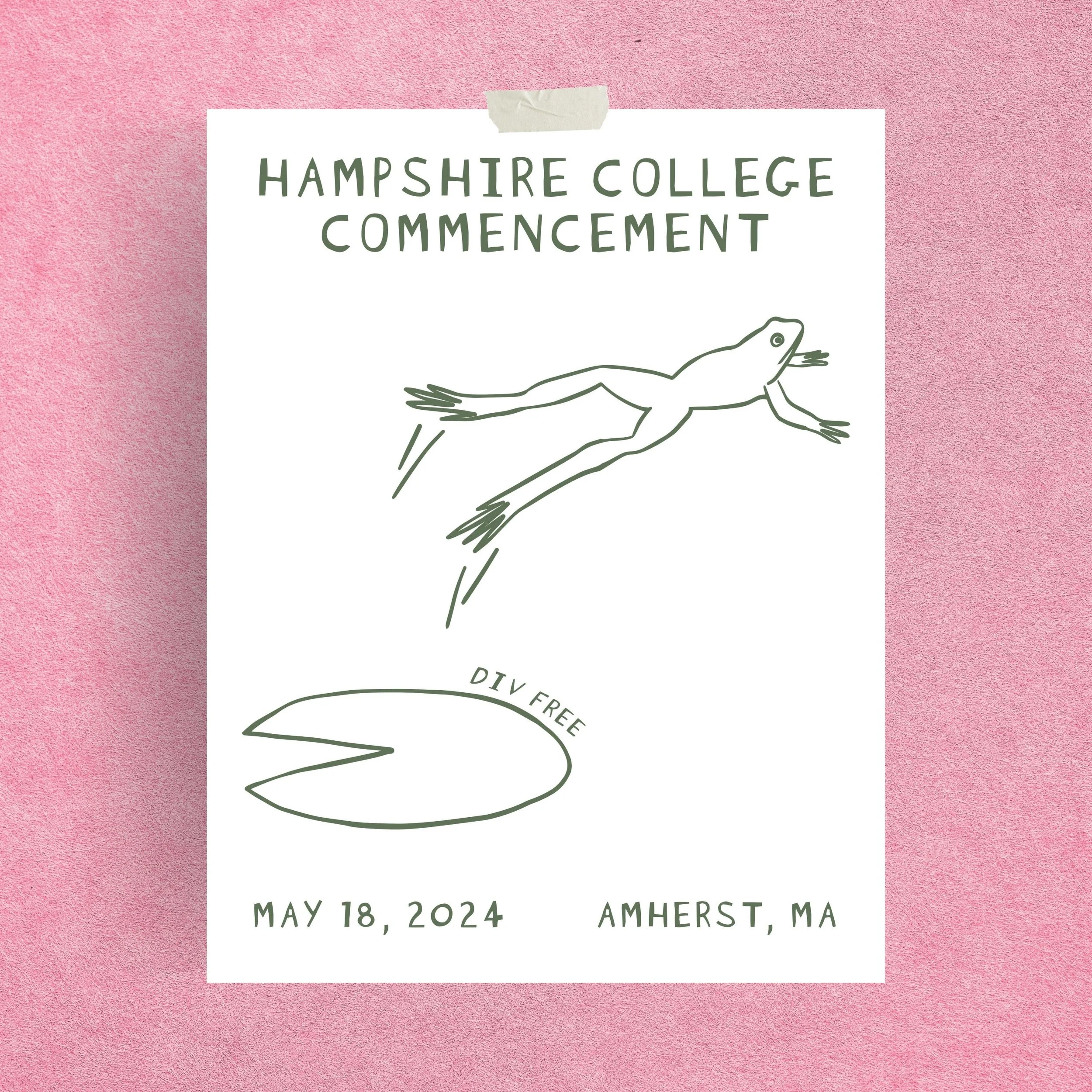
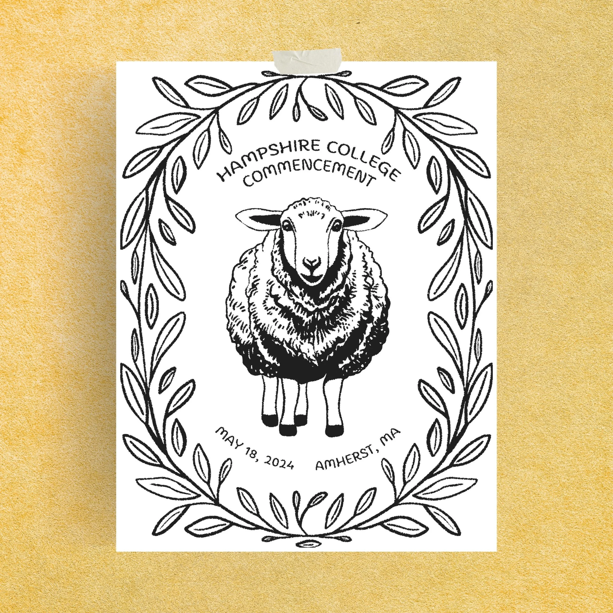
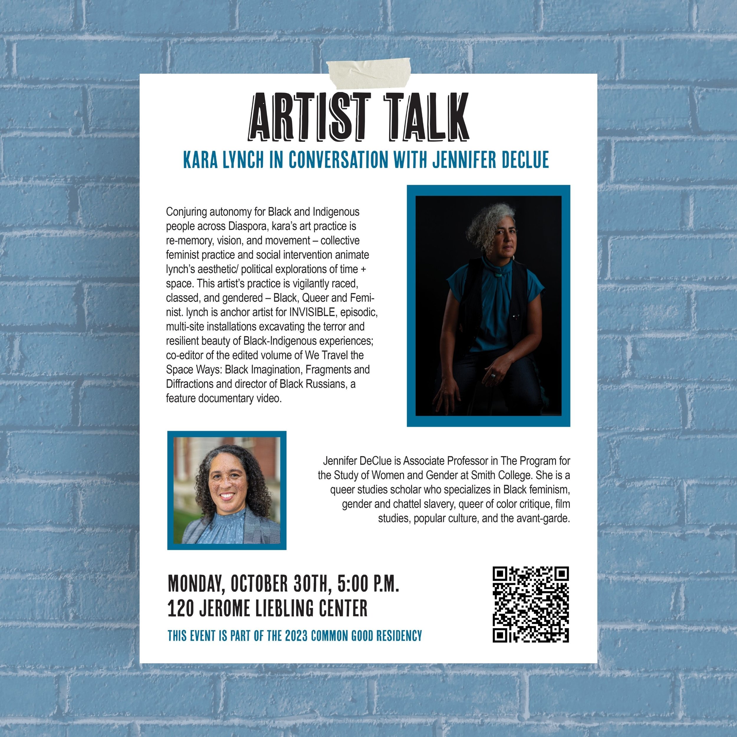
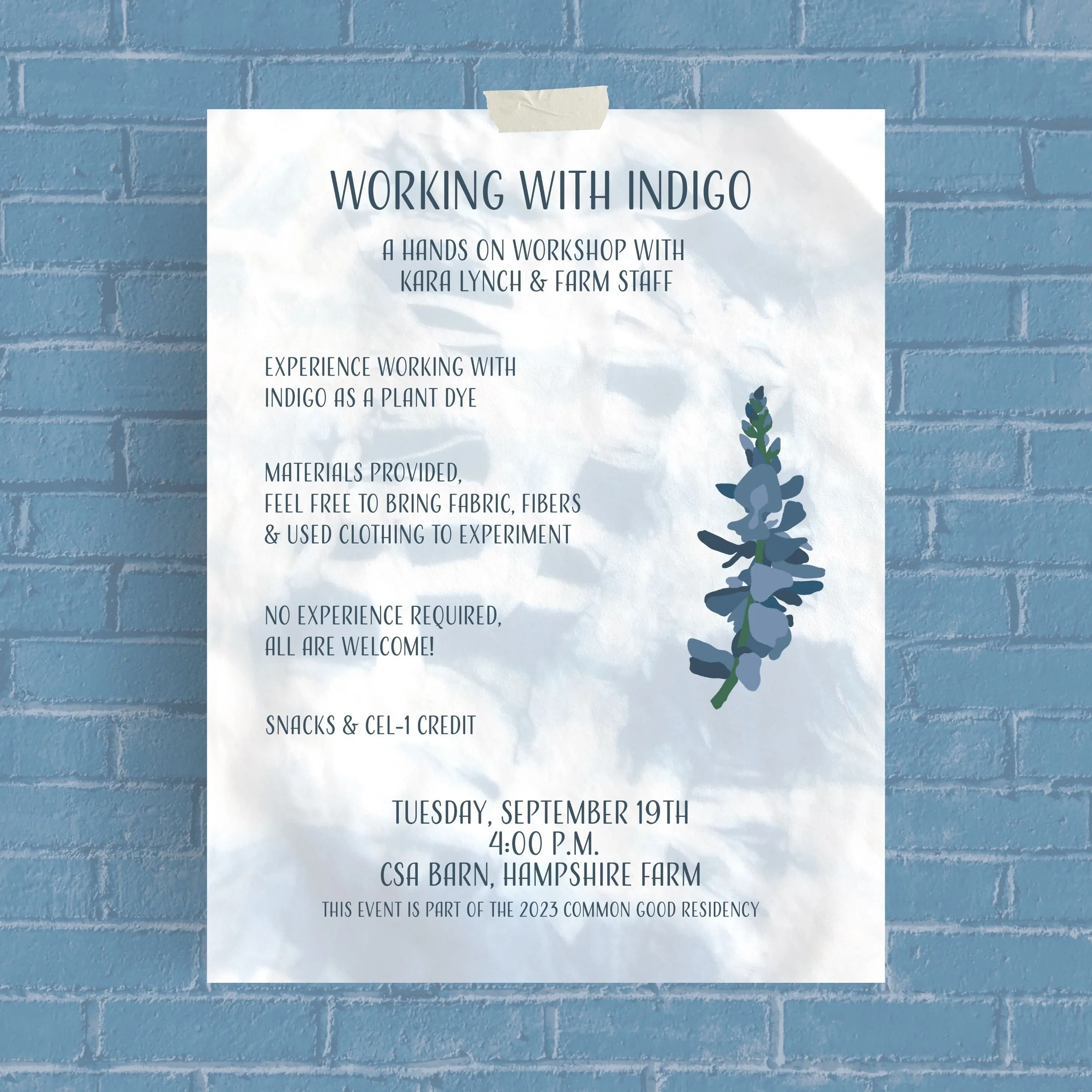
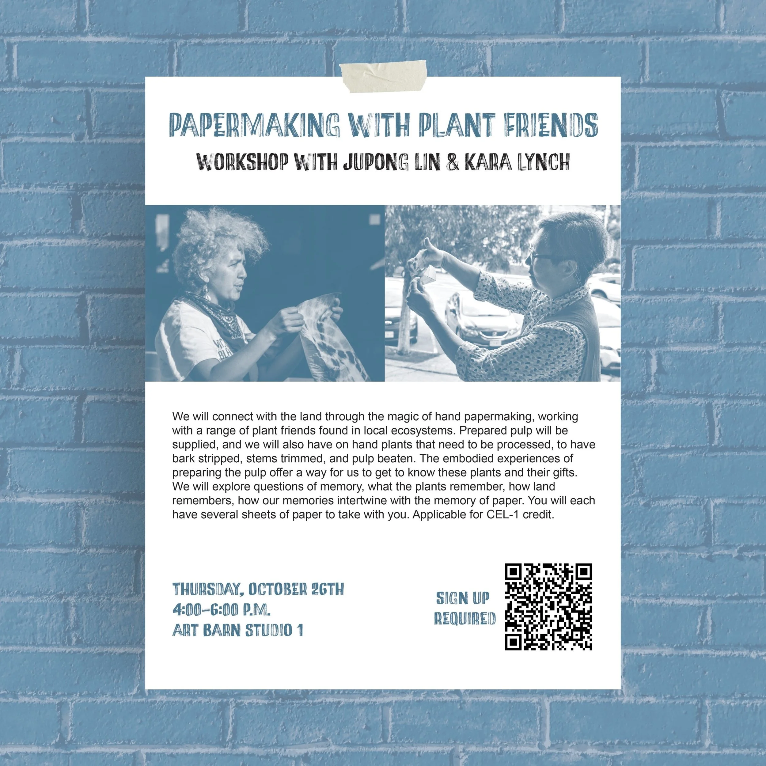
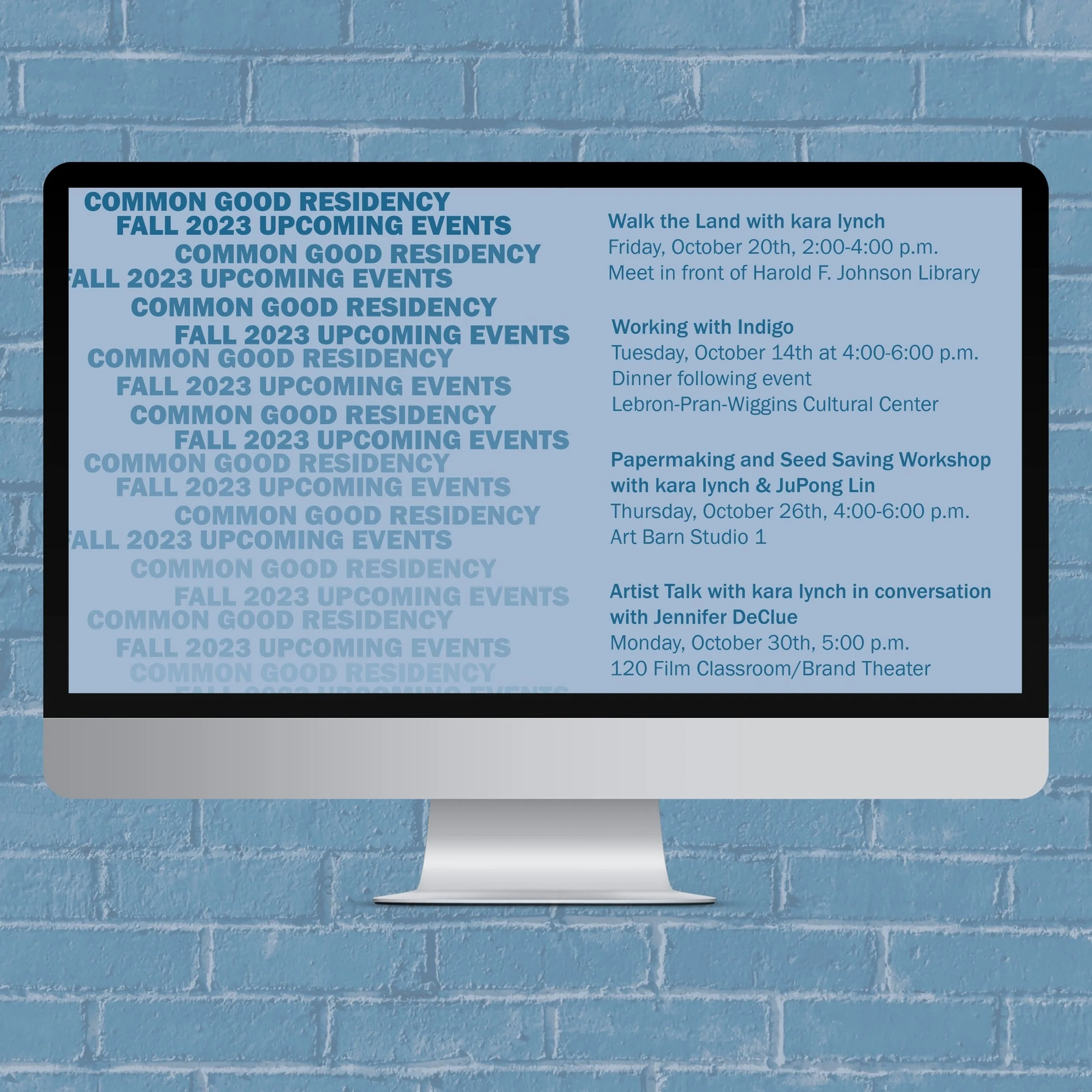
During my studies at Hampshire College, I worked as Design and Communications Coordinator for the Learning Collaboratives Network, SPARC Career Center, and Common Good Residency. I developed a distinct visual identity for each program, using color as the primary element connecting materials across platforms. I applied these identities across Google Sites, posters, digital displays, zines, and other print and digital assets. From the structure of each visual system to the platforms used to build the websites, my work was intentionally designed to be accessible and adaptable, allowing future student designers to easily build upon it.
conserve wetlands
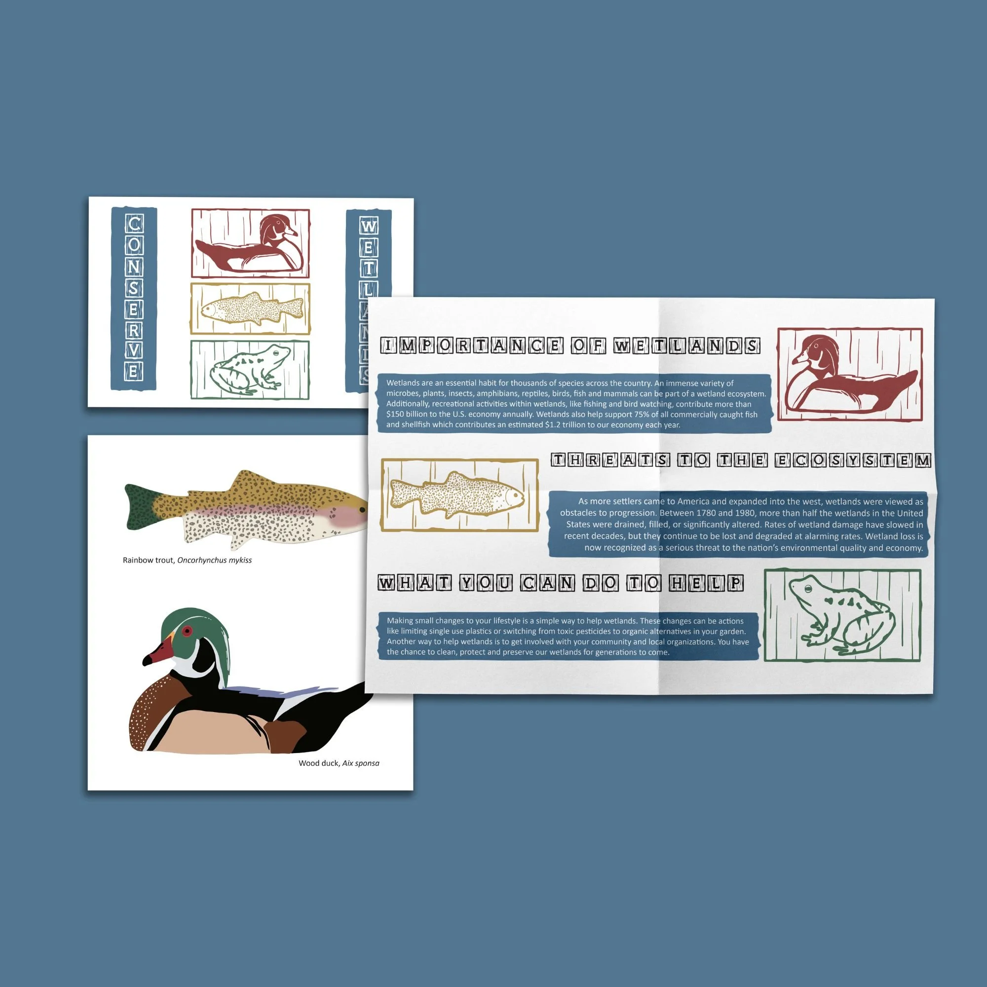
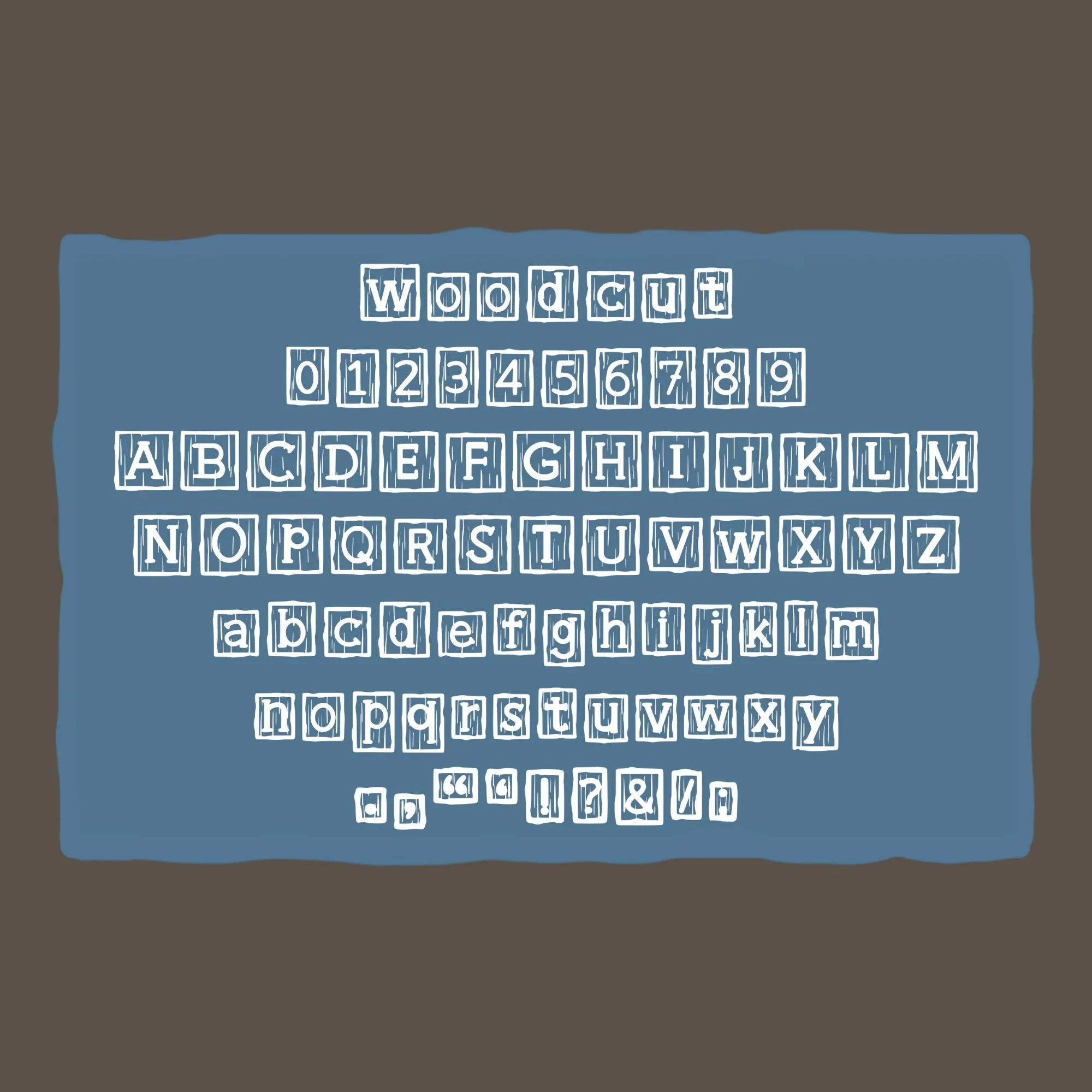
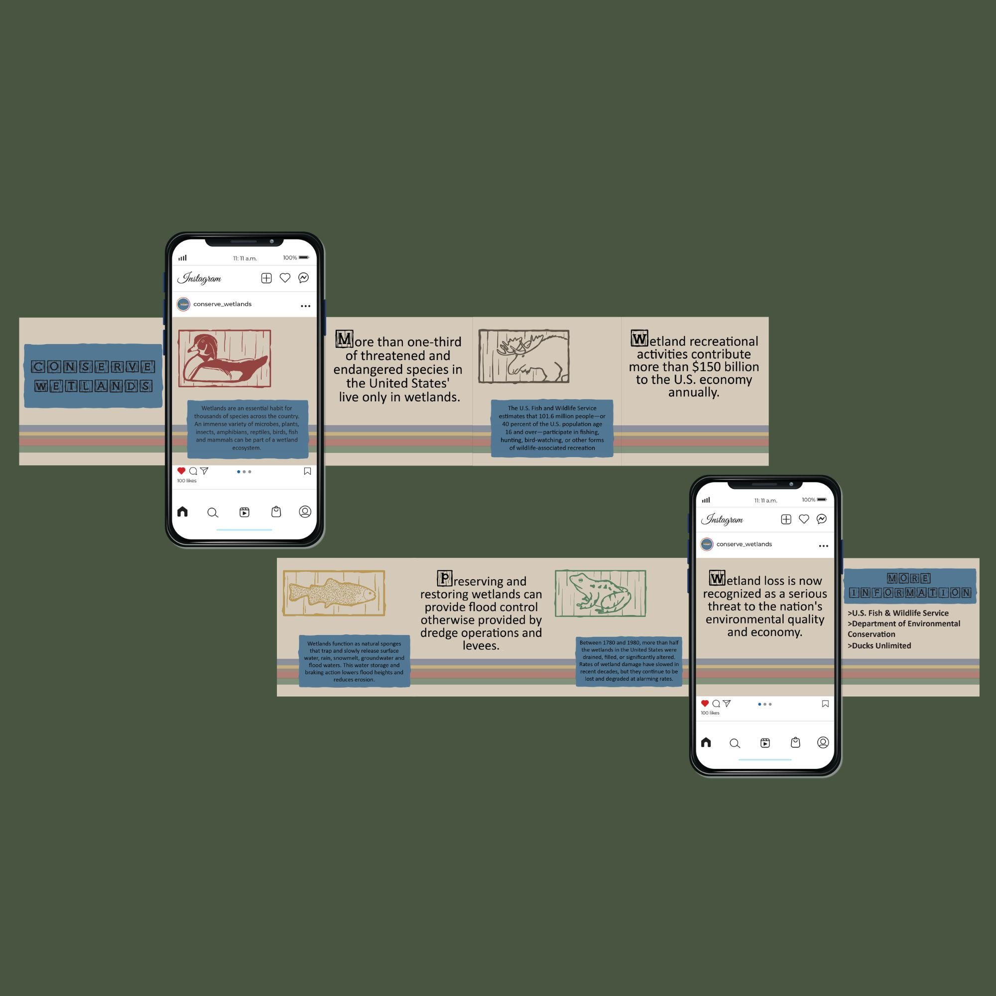
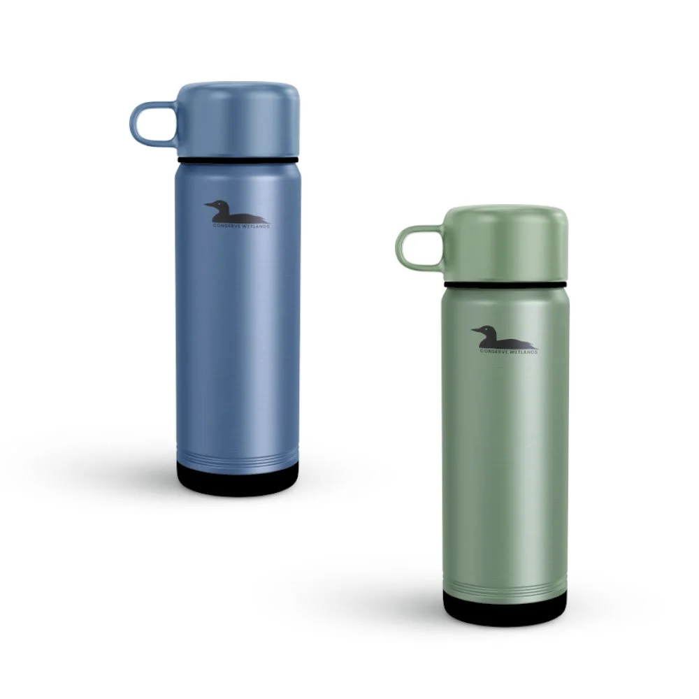
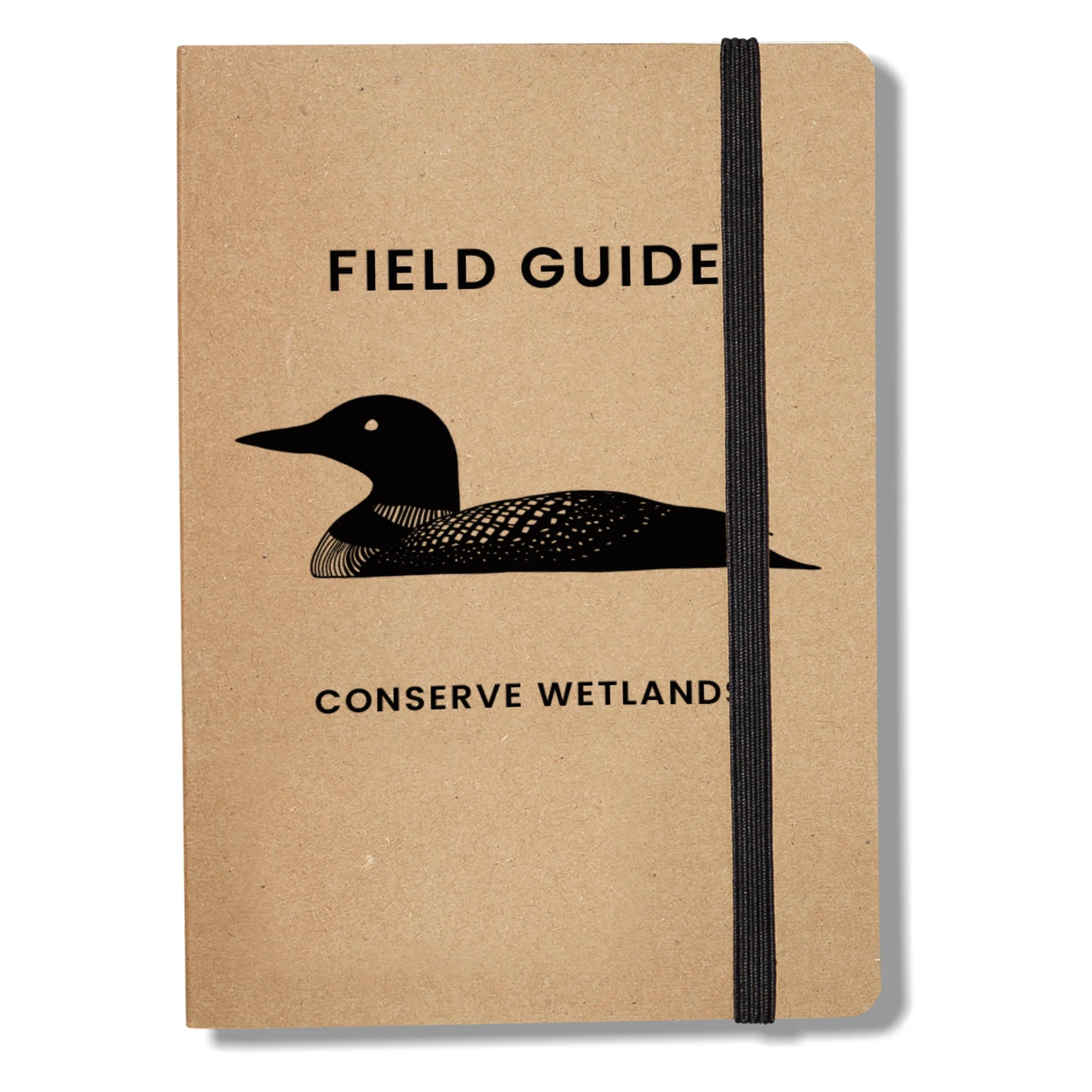
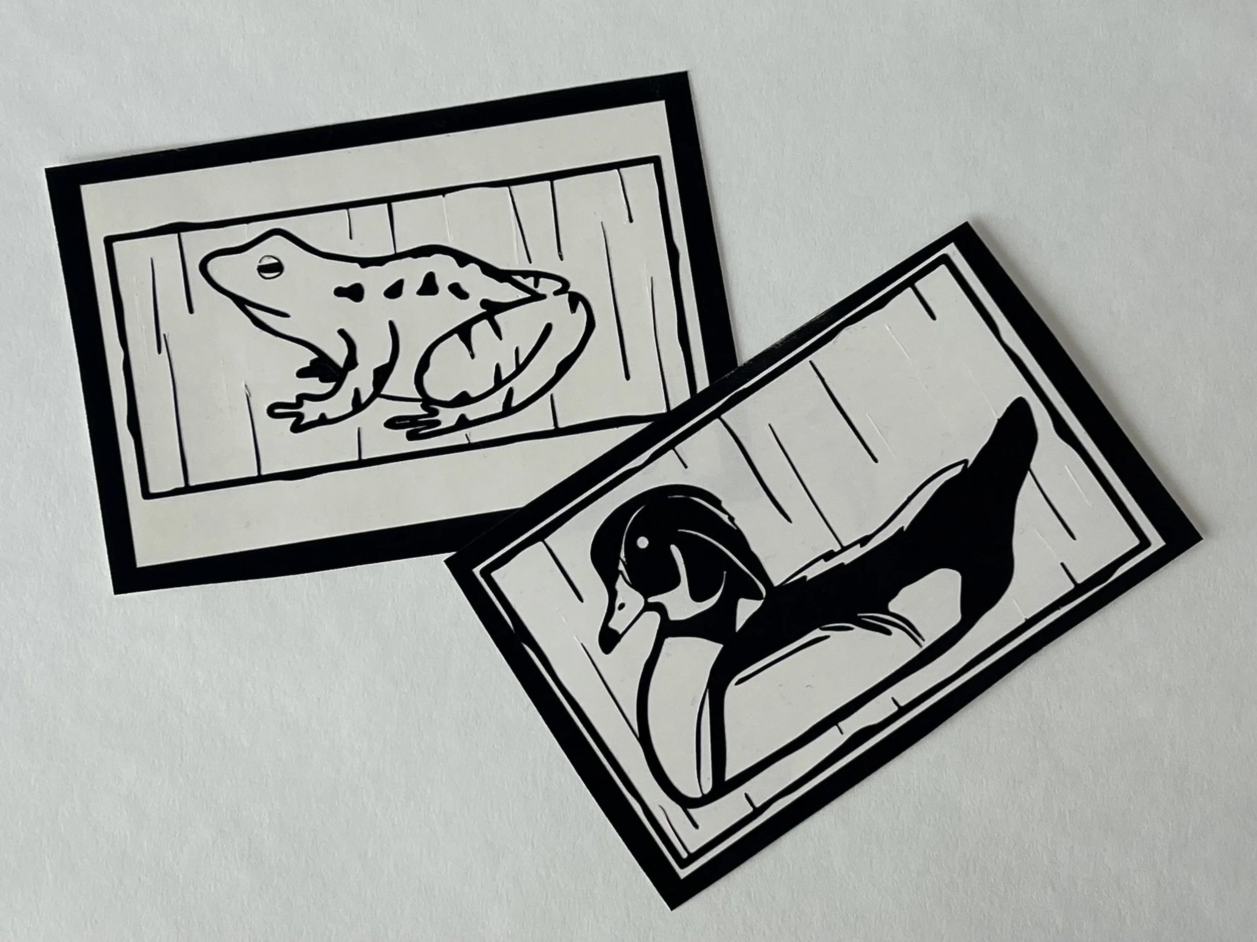
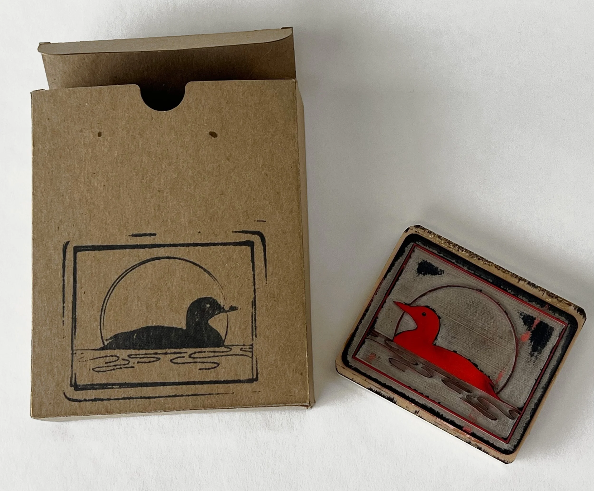
Conserve Wetlands is a conceptual brand developed as an exploration of illustration, typography, and production. For the project, I created a series of digital illustrations and designed an original typeface, applying the visual identity across a range of physical formats. I experimented with processes including laser cutting a custom rubber stamp, vinyl cutting stickers, and printing a folded poster. Working across these different forms of media expanded my design capabilities and gave me a stronger understanding of how digital concepts translate into physical production.
anna vikre jewelry
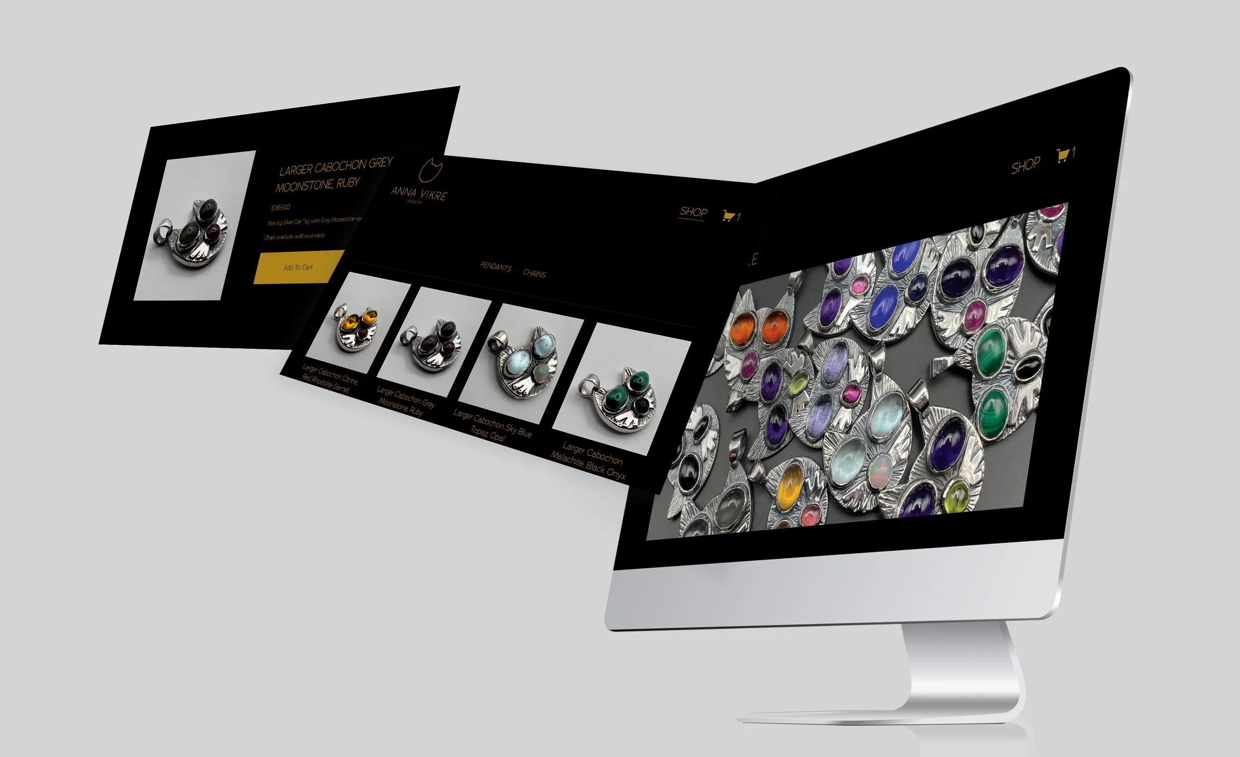
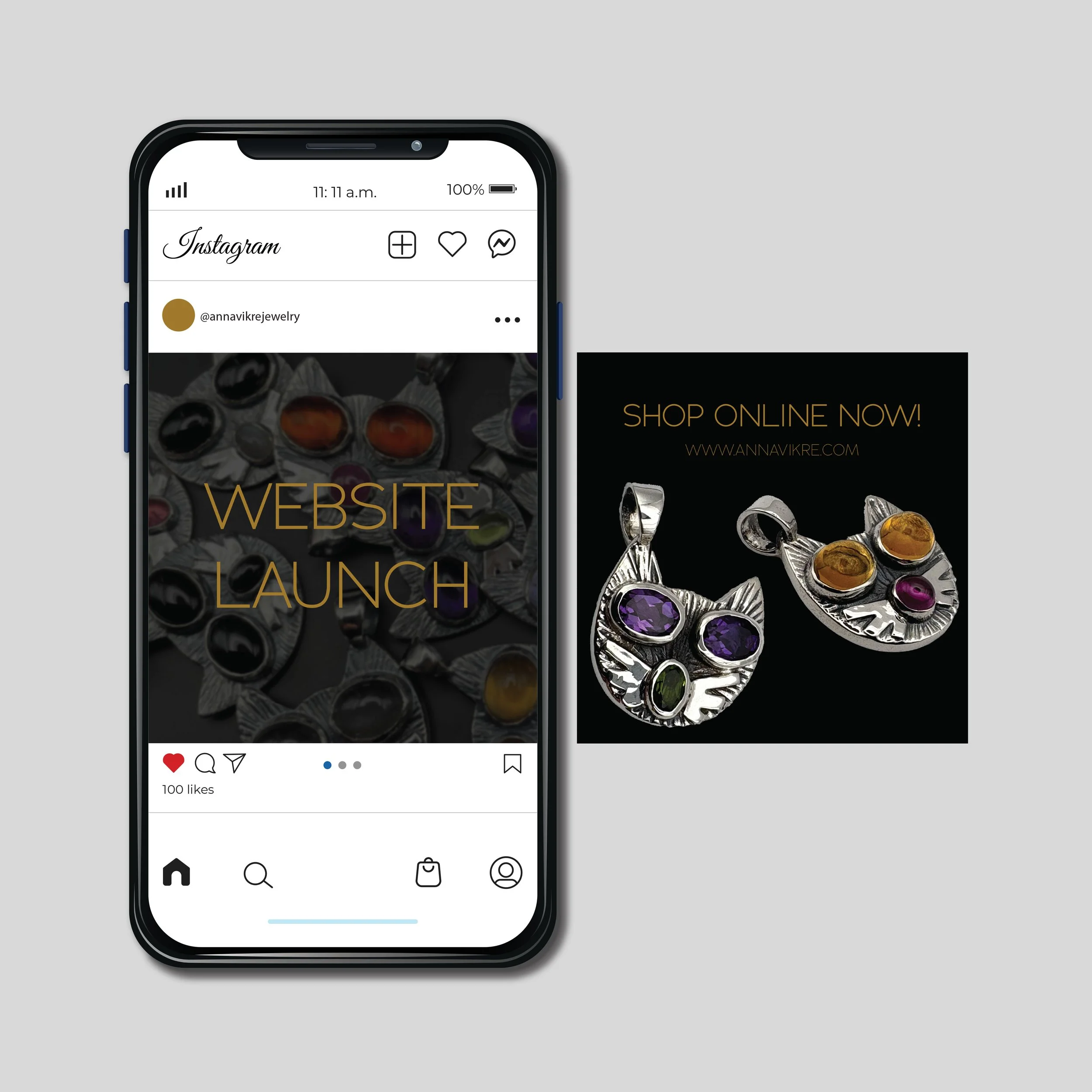
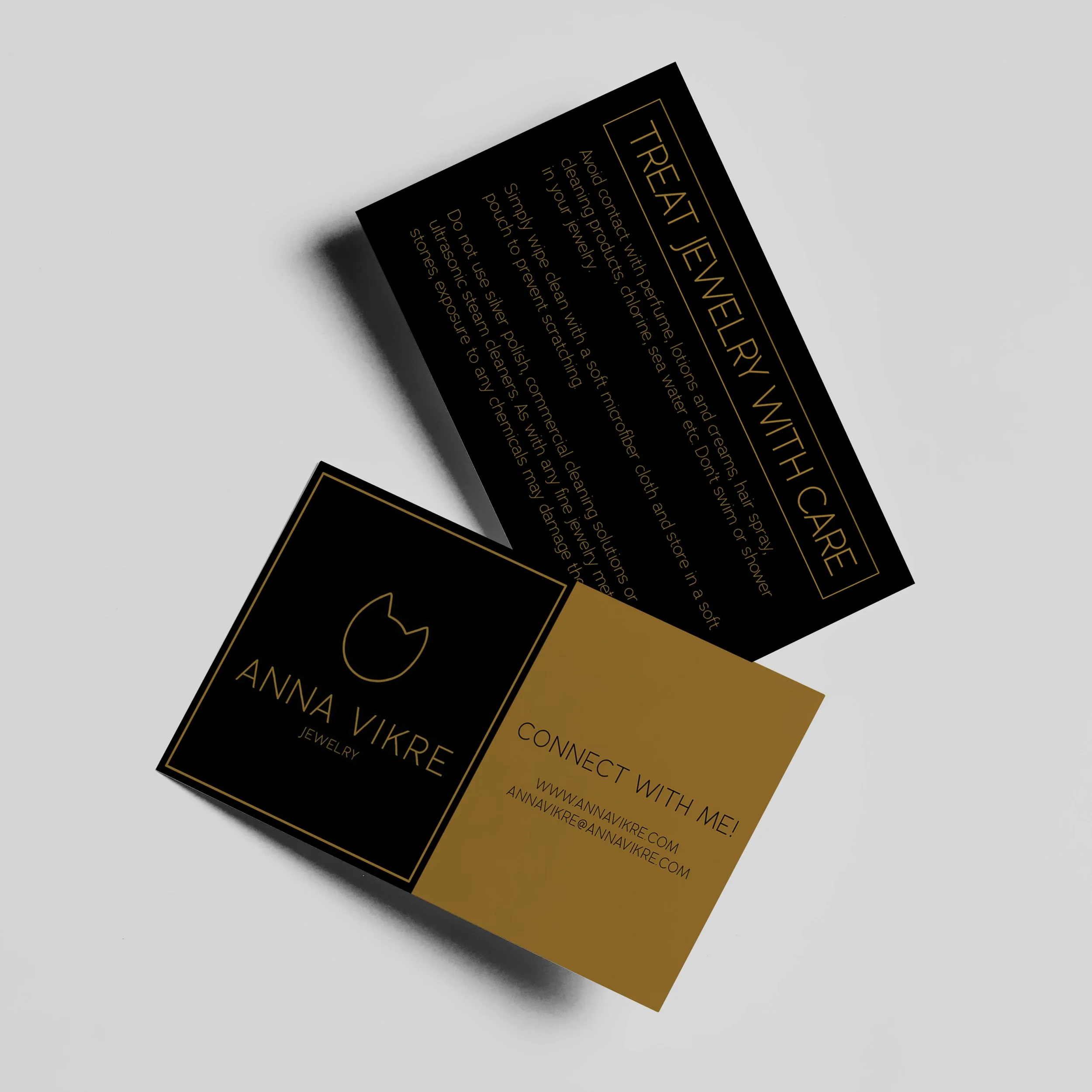
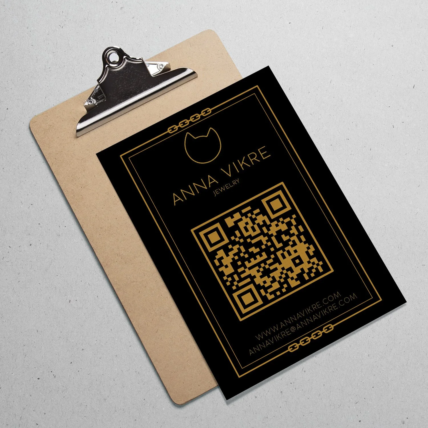
Anna Vikre is a jeweler and craftswoman who needed a website to showcase her one-of-a-kind jewelry. Working with her existing logo, I developed a visual identity around its established color palette and typography. The website uses a minimalist approach that keeps the focus on Anna’s craftsmanship and unique pieces while creating a cohesive presentation of her brand.
source naturelle
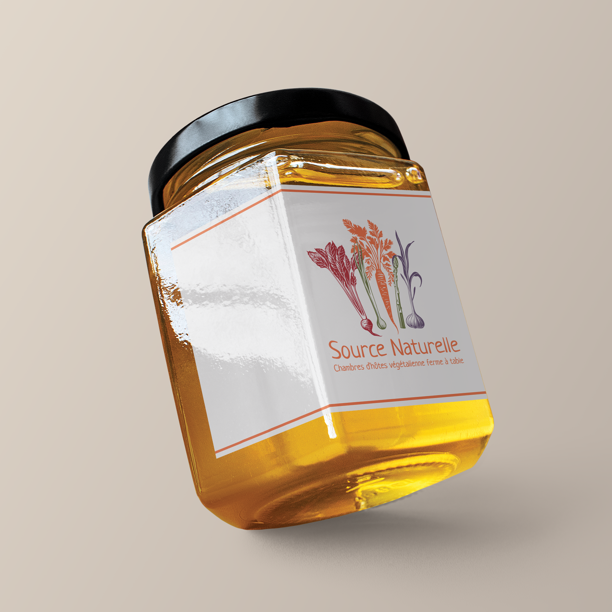
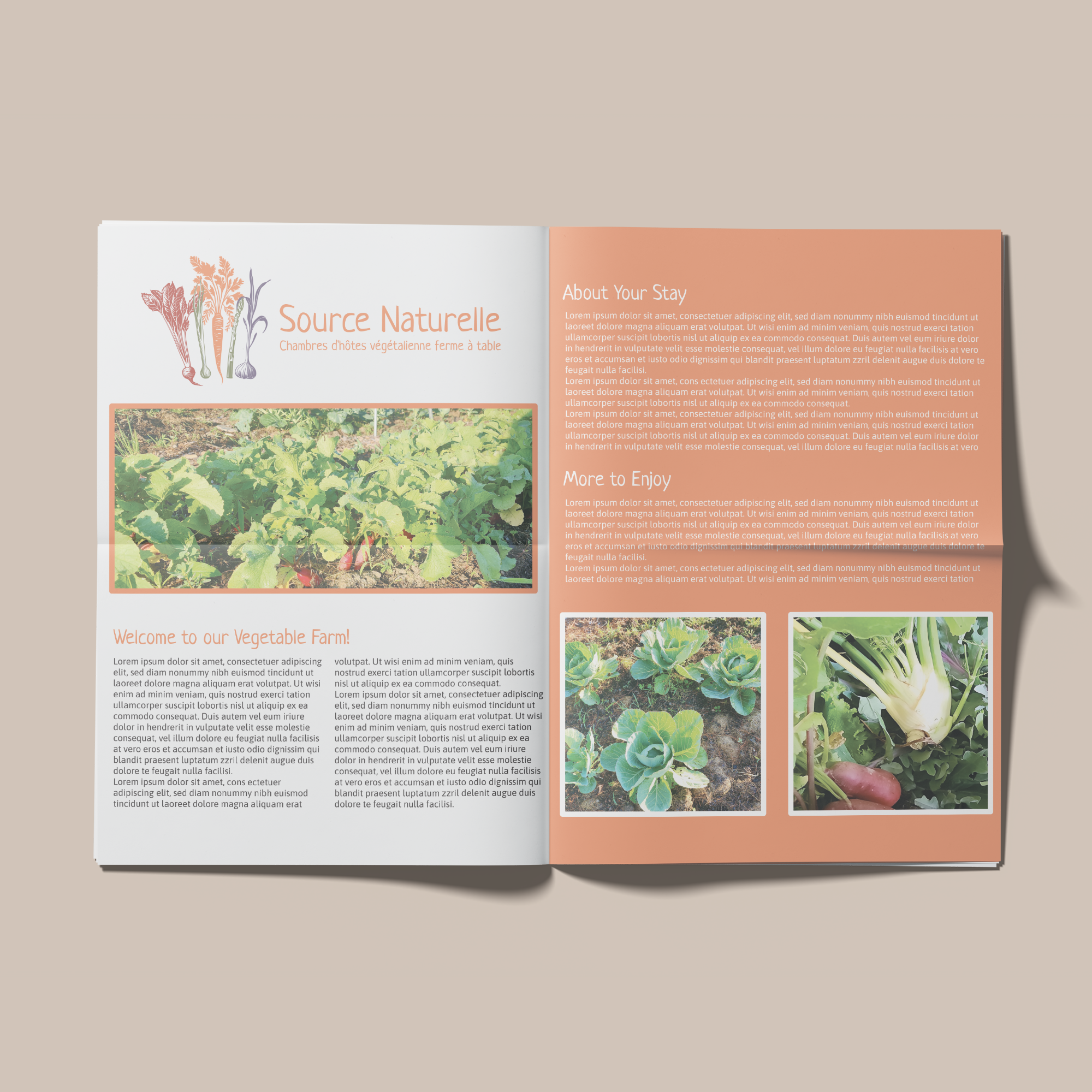
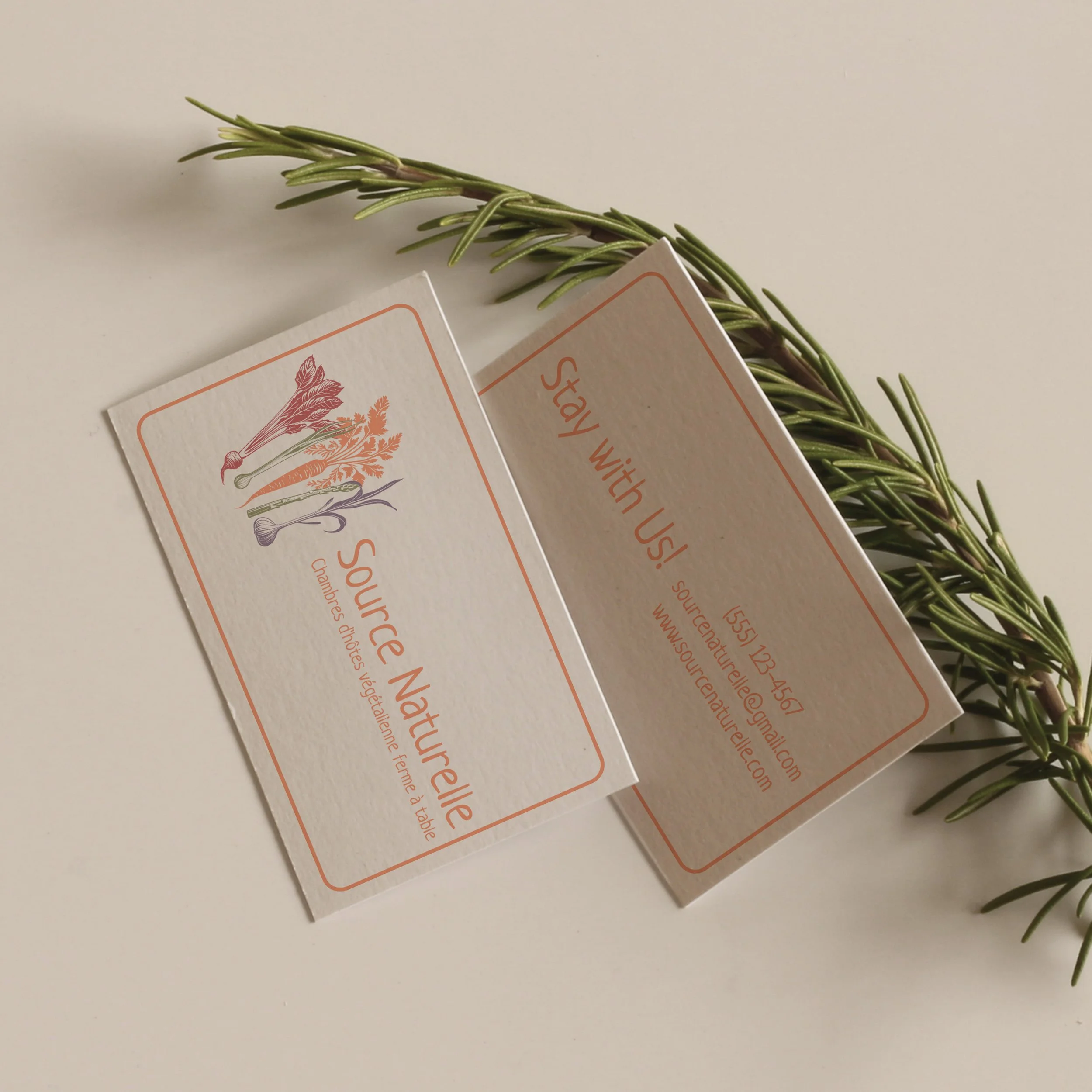
Source Naturelle is a vegan bed and breakfast on a vegetable farm in Canada. I developed the branding including the logo, color palette, typography and visual guide. The client’s primary request was a logo to showcase a variety of vegetables. I hand-drew vegetables for the logo, and chose an earthy color palette to give a wholesome tone to the visual identity. A Wix website is under development for Source Naturelle as well.
seymour sealing service inc.
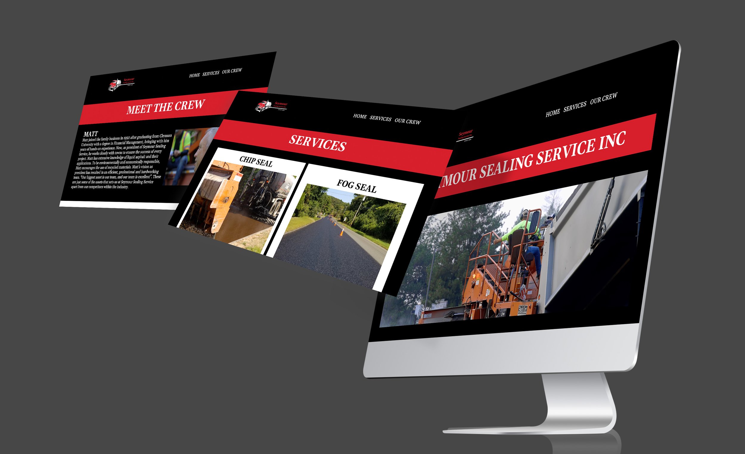
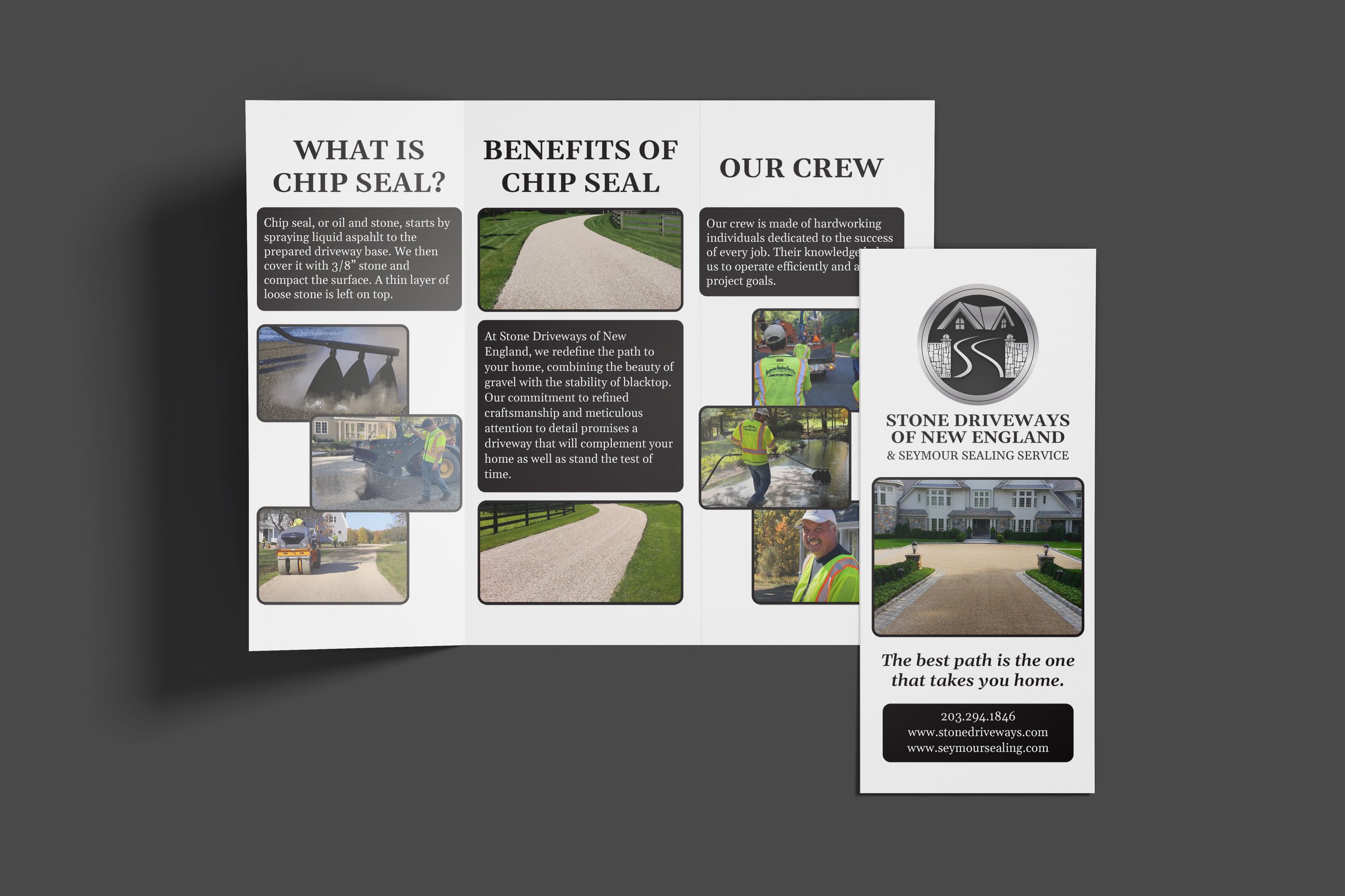
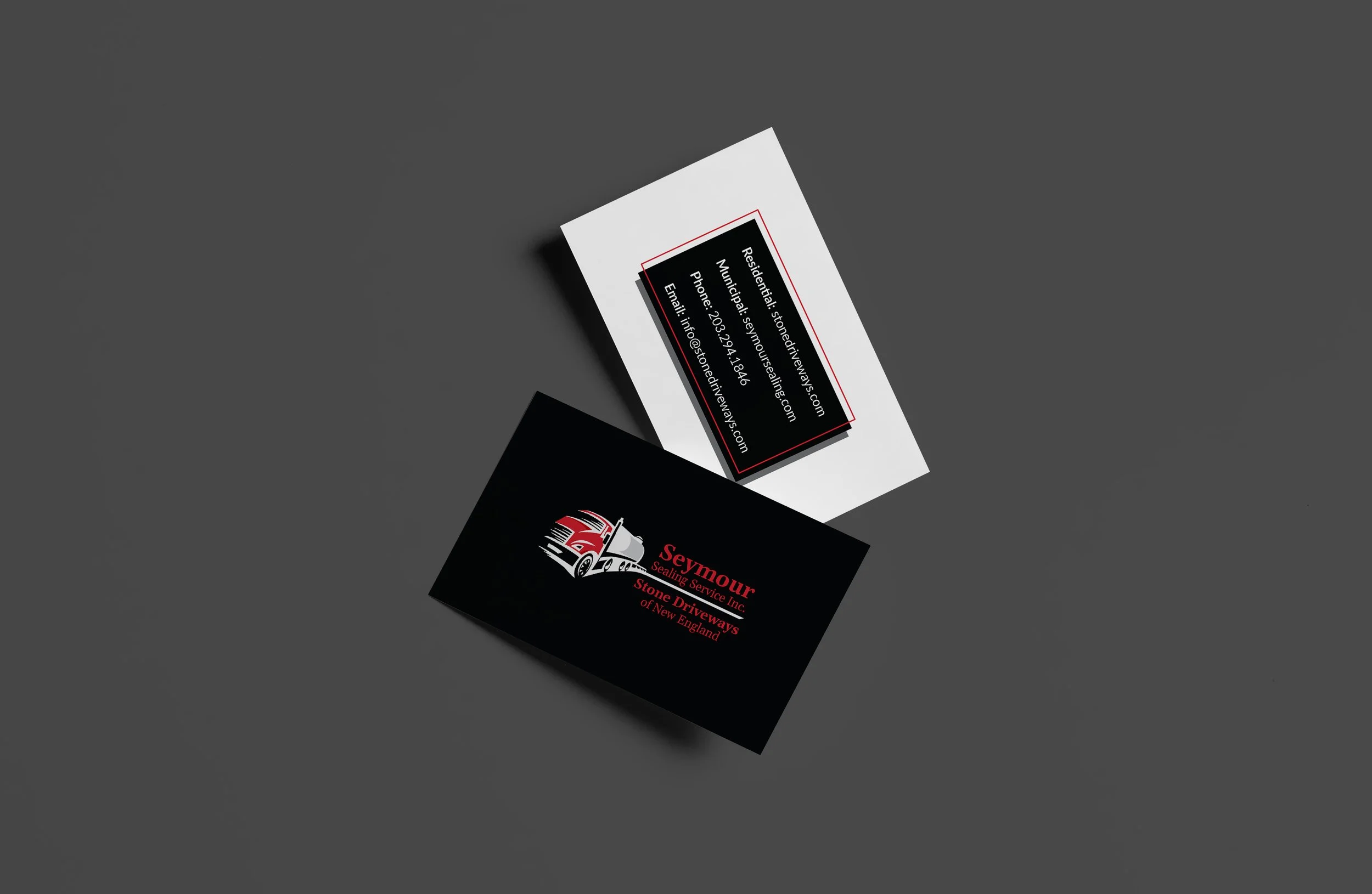
This company falls under two names, Seymour Sealing Service and Stone Driveways of New England. Using their existing logos as the foundation, I organized and completed their visual identity. I applied this branding to marketing collateral, social media and a website. I designed these assets to be legible and straightforward in regard to their client base.